| Author | Thread |
Comments Made During the Challenge  |
|
|
06/17/2008 08:25:02 PM |
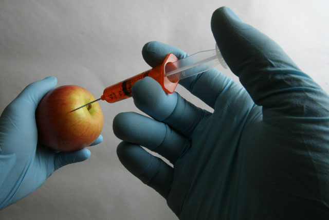
| I get the social comment but would like to have the background softer with the fruit in the foreground. |
|
|
|
06/17/2008 07:23:12 PM |
| Cool shot but kind of strange. |
|
|
|
06/17/2008 04:53:17 PM |
| this inspires dialog, which for me, is art :)it might be nice to see some more contrast ... and maybe higher resolution? maybe it's just my eyes. very nice |
|
|
|
06/16/2008 12:28:13 PM |
| An apple a day keeps the doctor away....hmmm |
|
|
|
06/16/2008 10:49:28 AM |
| One of my favorites in the challenge. I like the concept and the angle. Would've have liked a little better lighting, though; That hand in the foreground is a little too dark I think. |
|
|
|
06/15/2008 07:12:41 PM |
I like the fact that your making a statement with this shot, and I commend you for this. I'm not sure how it'll go down on DPC but its an original concept of an editorial nature which is something rarely seen here. The execution of the shot itself could have been better. Lower depth of field would have reduced the texture on your background and the creases would have been far less noticable. A lot of the hand in the foreground is in shadow and this is also working against you some. The colours are there but aren't vibrant enough for my tastes - they just don't pop.
I'd have maybe liked to have seen a closer crop, add an angle, lots of contrast and grain. Really crank up the drama and emotion in the picture to help your editorial statement hit home with the viewer. I give this a 6. |
|
|
|
06/15/2008 05:11:18 PM |
| More cold war / KGB than chemistry. If you see what I mean? |
|
|
|
06/13/2008 06:24:33 PM |
| That's clever. I have to say, I chuckled a bit when I read the name. :) |
|
|
|
06/13/2008 04:38:00 AM |
| good concept. lighting could be improved and the wide angle lens definitely was the wrong choice for this |
|
|
|
06/12/2008 09:18:15 PM |
| a very political comment on the face of food science - the image itself is pretty well delivered but the dark area of the hand of the right seems to overwhelm the shot IMO |
|
|
|
06/11/2008 04:17:38 PM |
|
|
|
06/11/2008 04:06:50 PM |
| Would make a good stock photo. |
|
|
|
06/11/2008 02:56:03 PM |
| Nice concept. I don't like the way it is executed. The background bothers me. |
|
|
|
06/11/2008 12:10:39 AM |
| good idea, but i think this could have used a bit more 'oomph' |
|
Home -
Challenges -
Community -
League -
Photos -
Cameras -
Lenses -
Learn -
Help -
Terms of Use -
Privacy -
Top ^
DPChallenge, and website content and design, Copyright © 2001-2026 Challenging Technologies, LLC.
All digital photo copyrights belong to the photographers and may not be used without permission.
Current Server Time: 02/01/2026 12:26:42 PM EST.