| Author | Thread |
|
|
08/22/2008 11:33:27 PM |
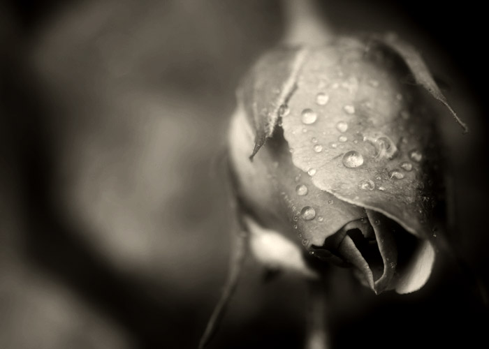
| I prefer the B&W version, and you did a good job on the conversion (doesn't matter how you did it!) The hint of color just seems to add another dimension to this. |
|
 Photographer found comment helpful. Photographer found comment helpful. |
|
|
06/03/2008 01:15:30 AM |
| very nice lighting and tone in this shot. A beautiful capture! |
|
| Photographer found comment helpful. |
|
|
06/02/2008 11:57:49 PM |
| Actually, I really like the B&W version - probably better than the colour! The tones in this are great. |
|
| Photographer found comment helpful. |
|
|
06/01/2008 07:27:54 AM |
| Beautiful! I agree with all of the others that this is very well done. |
|
| Photographer found comment helpful. |
|
|
06/01/2008 01:59:49 AM |
| This is really good, I normally do not go for this style of image, but the tonal range and spot on focus is great! |
|
| Photographer found comment helpful. |
|
|
05/29/2008 01:55:15 PM |
| Looks like a lot of my own shots, so naturally I like it. I get the same results from curves and selective colors after converting to b/w. |
|
| Photographer found comment helpful. |
|
|
05/27/2008 11:25:14 PM |
| I really like the tones, depth of field, and composition. Roses, for whatever reason, seem difficult to get good photos of. I don't know why that is since they are so beautiful. You have succeeded with this one...the water droplets add interest, and improve on an already very nice image. |
|
| Photographer found comment helpful. |
|
|
05/27/2008 06:31:53 PM |
Title included - a photographer's cliché blossom. A most difficult flora to photograph for a purpose in almost every respect. This is not too bad. ok ok I'll put in so you can slam mine.
I wonder if there has ever been a dpc rose challenge? |
|
| Photographer found comment helpful. |
|
|
05/27/2008 04:33:04 PM |
| The tones in this are rich and luscious. I think that the amount of negative space definitely adds to the composition, giving the rose room to "breathe". I actually like this version much better than the color one. |
|
| Photographer found comment helpful. |
Home -
Challenges -
Community -
League -
Photos -
Cameras -
Lenses -
Learn -
Help -
Terms of Use -
Privacy -
Top ^
DPChallenge, and website content and design, Copyright © 2001-2026 Challenging Technologies, LLC.
All digital photo copyrights belong to the photographers and may not be used without permission.
Current Server Time: 02/01/2026 05:54:14 AM EST.