| Author | Thread |
Comments Made During the Challenge  |
|
|
10/13/2002 07:42:00 PM |
| very nice and simple. 10--amitchell |
|
|
|
10/13/2002 09:51:00 AM |
Composition: Subject Placement, Cropping, Background8,
Technical: Focus, Exposure, Lighting, Processing10,
Appeal: Is it Interesting, Motivating, Etc.? 9,
Total Averaged Rating9. Autool
|
|
|
|
10/13/2002 05:45:00 AM |
| Very cool concept. beautiful execusion. 9 |
|
|
|
10/12/2002 01:10:00 AM |
| Nice lighting. Nice colors. boring subject. 6/10 |
|
|
|
10/11/2002 09:44:00 PM |
| This is a good picture, and a good concept, I like it!, the title however, could have been: "Yesterday's Love" |
|
|
|
10/11/2002 07:41:00 AM |
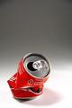
| That is some serious negative space. I like the angle and framing/cropping here. The white space really draws my eyes down to look at the crushed can. The lighting on the can is good, I wouldn't want it any brighter though. Focus is good, I think it could be better, but not bad at all. Great shot. Good luck in the challenge. ~Hbunch7187~ |
|
|
|
10/10/2002 10:26:00 AM |
| Great design - a top pick this week. |
|
|
|
10/09/2002 05:36:00 PM |
|
|
|
10/09/2002 02:22:00 AM |
| I guess a littel more breathing sapce on the left and right would help. Nicely planned and executed shot!6 |
|
|
|
10/08/2002 08:10:00 PM |
| Simple, but very effective - i like that! Good luck for the challenge! -9 |
|
|
|
10/08/2002 05:27:00 PM |
| nice shot :) interesting use of negative space as well... - setzler |
|
|
|
10/08/2002 04:06:00 PM |
| I like it. Good contrast, though a little blown. Good composition. 8 |
|
|
|
10/08/2002 01:58:00 PM |
| stark, bold graphic. well done. (8) ~mcmurma |
|
|
|
10/08/2002 07:50:00 AM |
| nice but i would have given it more space -7 |
|
|
|
10/08/2002 03:24:00 AM |
A couple of other shots like this in the challenge but I like this one most. Good use of negative space to show where the can "used" to stand tall.
8 - Konador |
|
|
|
10/08/2002 12:33:00 AM |
|
|
|
10/07/2002 11:05:00 PM |
| very nice composition, i like simple |
|
|
|
10/07/2002 10:47:00 PM |
| Well now - this is really great composition, but I thought the page was not displaying properly because all I got was the blank space at the top of my monitor. Good thing I scrolled down to investigate further! |
|
|
|
10/07/2002 10:31:00 PM |
| Good one! :-) Good luck! Grayce aka Gracious |
|
|
|
10/07/2002 09:20:00 PM |
| Nice job....really like it. Good luck. Justine |
|
|
|
10/07/2002 05:08:00 PM |
| A lot of people would hang this on their wall as a poster with an appropriate caption. Nice use of space. Graet exposure an colour. Expect a high score from me. |
|
|
|
10/07/2002 02:11:00 PM |
| One of my pictures of the week - great composition, very well lit, spot-on DOF - can't help wondering how many cans you had to crush in pursuit of the ideal shape...? |
|
|
|
10/07/2002 01:23:00 PM |
| Great use of negative space, and a clean shot of the can. One of my top 5 shots this week. 8 Jak |
|
|
|
10/07/2002 01:10:00 PM |
Simple, I like it.
How did you get it with no b/g? |
|
|
|
10/07/2002 12:54:00 PM |
| Great concept, but a bit too much white space. |
|
|
|
10/07/2002 07:07:00 AM |
| Great image. Nice effort. |
|
Home -
Challenges -
Community -
League -
Photos -
Cameras -
Lenses -
Learn -
Help -
Terms of Use -
Privacy -
Top ^
DPChallenge, and website content and design, Copyright © 2001-2026 Challenging Technologies, LLC.
All digital photo copyrights belong to the photographers and may not be used without permission.
Current Server Time: 02/01/2026 08:32:23 AM EST.