| Author | Thread |
|
|
05/26/2008 10:11:11 AM |
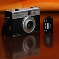
The first two things I notice straight away is the flat blue on the screen and the orange glare on the casing. Now the orange glare can be taken care of quite easily by placing another colour sheet (maybe white for the silver) just out of camera frame to catch the highlights. Next the blue screen seems a bit flat to me, the glare does not bother me as much as well, I do not know what the screen looks like exactly, but the 'icons' against the blue is make the whole thing seem a bit 'faked' to me.
Next, the hard light spot at 3rd location top right draws my eye a bit. Right above the w/t button. I am not sure what you used for lighting, but I would assume that is your main light based on the shadows cast, and such. I am wondering, if you used a white/silver bounce in front of the camera and moved the light more towards the rear instead of the top and side, and let it bounce off the reflector if it would gain a more even lighting cast and highlighted edge? Also help to eliminate some of the shadows on the body. To help eliminate the front shadow this would cause use a pin-light at the base to knock that shadow off.
I read your comment on the 'bully' idea, which I like the idea, though it appears to me that the Nikon is the bully here and not the Canon/Rebel. The reason is, the Nikon takes center stage here and even though the lense of the Canon is on screen the warm oranges push the Nikon out front. I think what I would have done to convey the idea would be to create a harsh angle whereas the Canon was in front and the Nikon behind giving an added distortion and monstrous size advantage to the Canon to truly give that Bullying feel. Maybe even a higher angle 'over the shoulder' so to speak of the Canon to show the little Nikon and an image of the Nikon nice and small on the Screen of the Canon?
Or, if you desire to keep this perspective with the Nikon in front raise the Canon up higher to make it appear larger than life. With a slight up angle, the Nikon looking up to the Bully would help convey this idea.
Overall you did a nice job, focus is nice and colour saturation of the background is nice.
Andrew |
|
 Photographer found comment helpful. Photographer found comment helpful. |
|
|
05/25/2008 08:29:54 PM |
| Like the idea - tried something similar but ran out of time. (Couldn't get my L10 to display an edited image I put on the card). Glad you did this. |
|
| Photographer found comment helpful. |
Comments Made During the Challenge  |
|
|
05/25/2008 07:04:30 PM |
| i love the use of color in this..well done! |
|
| Photographer found comment helpful. |
|
|
05/25/2008 06:25:15 PM |
| interesting concept, seems a bit too orange though |
|
| Photographer found comment helpful. |
|
|
05/25/2008 06:14:35 PM |
| One is in need for her......: ) |
|
| Photographer found comment helpful. |
|
|
05/24/2008 05:30:01 AM |
| Interesting idea, love the orange. 8 |
|
| Photographer found comment helpful. |
|
|
05/23/2008 07:05:58 PM |
| Neat idea, and well set up. |
|
| Photographer found comment helpful. |
|
|
05/19/2008 09:33:28 AM |
| nice complementary colors and clear focus. |
|
| Photographer found comment helpful. |
|
|
05/19/2008 06:43:39 AM |
|
| Photographer found comment helpful. |
|
|
05/18/2008 09:35:18 PM |
| I really like the orange background. Would like the image in the LCD a little better without the hot spots on the lens. |
|
| Photographer found comment helpful. |
|
|
05/18/2008 08:09:24 PM |
| That's very clever...I like the orange and the way the blue of the screen compliments that...well done 8 |
|
| Photographer found comment helpful. |
Home -
Challenges -
Community -
League -
Photos -
Cameras -
Lenses -
Learn -
Help -
Terms of Use -
Privacy -
Top ^
DPChallenge, and website content and design, Copyright © 2001-2025 Challenging Technologies, LLC.
All digital photo copyrights belong to the photographers and may not be used without permission.
Current Server Time: 04/08/2025 01:34:47 AM EDT.