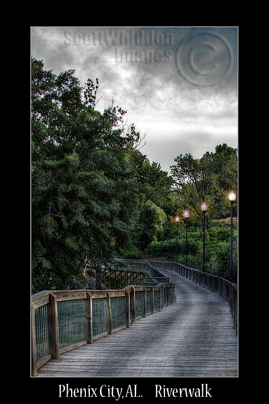
This is a nice image on it's own, but the critiques made by others are very true. For a nice inviting postcard-type image, you do need to warm up the colours and punch the saturation. Bring out the reds in the wooden railing, bring out the lush yellow/greens in the trees (important to remember that lush trees and grass are often more toward the yellow spectrum, not real green)
The overcast sky is nice and dramatic, but rather forbidding. You could overcome it with some nice tungsten warmth from the lamps (there's a little there around each light, but you could go much bigger, maybe even spilling into pools along the boardwalk. The patches of sunlight on the trees will also be helped with a little orange kick. But start with adjusting the overall colour balance more toward red/orange, and saturate it, and then work on local adjustments later. i'd also be inclined to darken in some more shadows under the trees on the left. The HDR look is nice, but it's also good to have areas of more shadow and less detail to help define the main lines.
I don't really like the choice of crop. I think you missed off too much of the foreground and the right hand side to really pull the viewer in.
It also looks damned dark to me as well, and a little cold. The level of lighting on the street lamps is inconsistent which makes it look synthetic and the grey smudges around the edges of the wooden fence posts (look at the left side) distract me and take away from the natural feel of the setting.
Also, I think the trees need to be dodged to brighten the leaves because they look a little dull and lifeless and give them a bit more 'zing', maybe by adding some yellow to the greens to make them warmer or something.
The composition is ok, but my opinion raised in the first para still stands. I also can't help thinking it would look more appealing with a blue sky and not the overcast grey. But then again, this depends on what you're using it for. If it's a personal project then ignore everything I just said as it holds no meaning to your own work, but if this is for a client then i'm not sure this would be the look they had in mind... especially if they're trying to attract people to the place. It certainly is different though.
So, to summarise: I think it's ok, but too dark to be engaging.
In response to your request for feedback - Certainly looks lush, but if your client is seeking wetlands, I don't think this shows them, especially from this angle/perspective. It's a nice image and you've edited it well (although I wonder whether cloning out so much of the 'manmade environment' is also sought, but only you know that). The colors, especially the greens/foliage, perhaps a little richer/more saturation - especially if that (the environment) is one of the main 'selling points'. This image showcases the bridge well, but not the surrounds/environment/habitat, in my opinion.
good processing. could be a little warmer. lamps don't look natural, I'd clone the foremost one to replace the three others. there's a small part of one lamp at the right edge, at thr top of the trees that shouldbe clones out