| Author | Thread |
Comments Made During the Challenge  |
|
|
05/13/2008 05:49:21 PM |
| Looks like a postcard (that's not a bad thing IMO). |
|
 Photographer found comment helpful. Photographer found comment helpful. |
|
|
05/13/2008 05:56:54 AM |
| the overall sharpness of your image makes this photo stand out |
|
| Photographer found comment helpful. |
|
|
05/12/2008 04:09:32 PM |
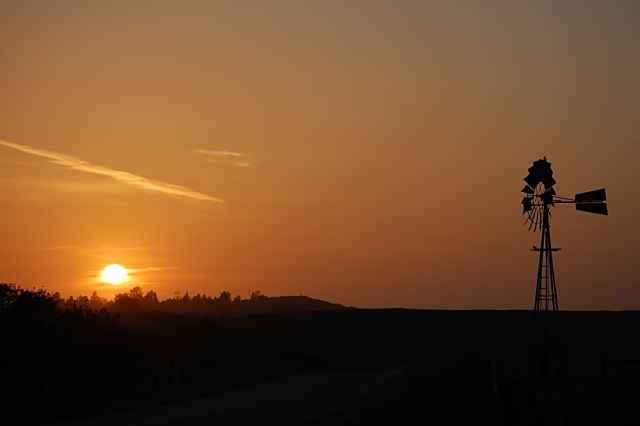
| this is pretty and quiet scene, would be great if we could more easily see the path leading to the windmill. it's almost "too much" for my eyes to travel from the sun tot he other side of the frame to the windmill. |
|
| Photographer found comment helpful. |
|
|
05/12/2008 05:33:12 AM |
| nice photo but a bit boring |
|
|
|
05/09/2008 02:22:53 PM |
This has a great feel to it. While it's not always possible, in a shot like this, to get a better angle before the shot "goes away", I think the shot would have been more interesting if you could have moved more to the right (as you look at the shot), to narrow the apparent distance between the windmill and the sun. As it is, they seem like two, separate and disconnected elements because of the distance between them.
Still, a very nice image. |
|
| Photographer found comment helpful. |
|
|
05/09/2008 06:53:49 AM |
| this just seems plain and a little boring. |
|
|
|
05/09/2008 06:05:38 AM |
| I like how the picutre has like two sides a darker side n a ligther side |
|
| Photographer found comment helpful. |
|
|
05/08/2008 04:16:35 PM |
| nice picture, beatiful colors |
|
|
|
05/08/2008 01:12:11 PM |
| Very simplistic :) always a good thing. |
|
| Photographer found comment helpful. |
|
|
05/08/2008 01:01:12 AM |
|
|
|
05/06/2008 11:32:58 PM |
| MIght be stronger with more of the foreground cropped out...it's too dark to add much to the image. |
|
| Photographer found comment helpful. |
Home -
Challenges -
Community -
League -
Photos -
Cameras -
Lenses -
Learn -
Help -
Terms of Use -
Privacy -
Top ^
DPChallenge, and website content and design, Copyright © 2001-2025 Challenging Technologies, LLC.
All digital photo copyrights belong to the photographers and may not be used without permission.
Current Server Time: 04/07/2025 09:05:03 PM EDT.