| Author | Thread |
Comments Made During the Challenge  |
|
|
05/07/2008 06:42:32 PM |
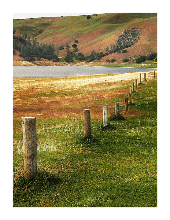
| I like the view of the posts in the foreground, but my eye is then drawn to the background and is wandering around back there instead of being on the subject. I think a different perspective may have been good. |
|
 Photographer found comment helpful. Photographer found comment helpful. |
|
|
05/06/2008 03:15:12 AM |
| to over sharp and it might have been better to crop the sky right out the image looks lopsided. |
|
| Photographer found comment helpful. |
|
|
05/05/2008 12:24:17 PM |
| The border and the white in the upper left make it look like a torn photo. Crop that away and you have a very nice set of colors and textures. |
|
| Photographer found comment helpful. |
|
|
05/04/2008 08:32:47 PM |
| I love your sweet image. I like the leading lines, composition, colors and your editing, but the sky, or lack of sky bothers me. jmho. This reminds me of a painting. |
|
| Photographer found comment helpful. |
|
|
05/04/2008 10:10:23 AM |
| to my eye, there is too much of a gap between the first and second post, maybe a crop . nicely sharpened, nice colours |
|
| Photographer found comment helpful. |
|
|
05/03/2008 04:08:36 PM |
| The big border is a bit distracting for me. -BB |
|
| Photographer found comment helpful. |
|
|
05/02/2008 05:12:11 PM |
|
| Photographer found comment helpful. |
|
|
05/01/2008 12:59:55 AM |
| Lovely colours. The top left corner is a bit out of place. A lower crop? |
|
| Photographer found comment helpful. |
Home -
Challenges -
Community -
League -
Photos -
Cameras -
Lenses -
Learn -
Help -
Terms of Use -
Privacy -
Top ^
DPChallenge, and website content and design, Copyright © 2001-2025 Challenging Technologies, LLC.
All digital photo copyrights belong to the photographers and may not be used without permission.
Current Server Time: 04/08/2025 01:45:45 AM EDT.