| Author | Thread |
|
|
04/30/2008 03:01:52 AM |
|
Comments Made During the Challenge  |
|
|
04/29/2008 04:42:19 PM |
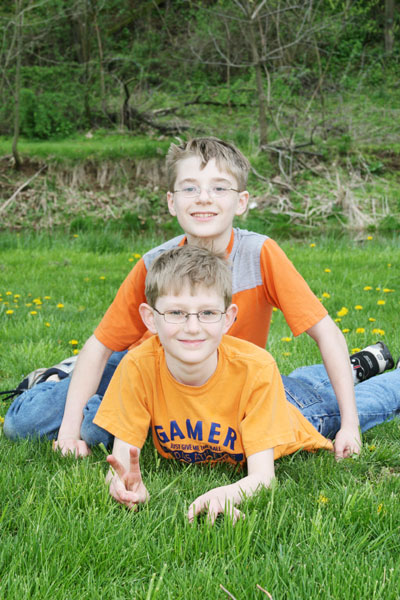
A cute shot, though it's got some problems. Highlights on their faces are a little overexposed. The ridge right behind the upper boys head tends to draw the eye. A wide aperture could have helped to blur it so as to not be as distracting, or a perhaps a steeper perspective, so that it was not in the picture. Also, your file size is a lot smaller than was allowed. It's only 84k and you could have used up to 150k for this challenge. You have likely lost some clarity and detail to JPEG compression, though I do not see any obvious artifacts. Check the JPEG compression settings in your image editor and always try to save as close to the limit for a challenge as you can get it without going over.
Whew! Hope that wasn't too harsh. |
|
|
|
04/29/2008 04:19:39 PM |
| This seems too "snapshot" like to me. The focus is not sharp and the background is distracting, especially the two lines that run your your son's head. Using a shallower depth of field might help by rendering the background blurrier. |
|
|
|
04/29/2008 03:49:20 AM |
|
|
|
04/28/2008 09:11:27 PM |
| Cute boys. The face on the upper boy is a little over-exposed. The background is also a little distracting, the photo would be greatly improved by adding a shallower DOF so the background was not in focus. |
|
|
|
04/28/2008 11:21:57 AM |
|
|
|
04/27/2008 01:22:12 PM |
| Very cute. I think that a little bit of contrast would have added some depth to the shot and maybe drawn them out a bit more. ? |
|
|
|
04/25/2008 08:26:42 PM |
| Cute kids but skin tone is very washed out. |
|
|
|
04/25/2008 05:55:18 AM |
| Not a very interesting idea. Compisition is weak, but the color is good. |
|
|
|
04/24/2008 03:28:41 PM |
| Either the focus needs to be better, or the image needs to be sharpened |
|
|
|
04/23/2008 06:51:09 PM |
| A nice sibling shot but the boys faces and shirts appear a bit washed out. 7 |
|
|
|
04/23/2008 05:44:11 PM |
| the boys are great models, very handsome, the idea is cute |
|
|
|
04/23/2008 05:34:56 PM |
| Their faces seem a bit overexposed. |
|
|
|
04/23/2008 02:51:36 PM |
| Cute boys. I think this picture could have used more saturation. |
|
|
|
04/23/2008 11:49:45 AM |
| I find it hard to comment on pictures that obviously mean a lot more to you than to the random viewer/voter. I'll just talk about technicals. focus is where it belongs. exposure is a tad too bright for the skin. good control of the reflection in the glasses. from a composition POV: too bad you cut off the one foot on the right side. I think going to landscape would have helped controlling the background better. the band of shrubs take away the focus from the boys. |
|
|
|
04/23/2008 05:54:43 AM |
| this is a cute shot. i like the kids shirt. but the colors are nice and the background isnt too harsh good job |
|
Home -
Challenges -
Community -
League -
Photos -
Cameras -
Lenses -
Learn -
Help -
Terms of Use -
Privacy -
Top ^
DPChallenge, and website content and design, Copyright © 2001-2025 Challenging Technologies, LLC.
All digital photo copyrights belong to the photographers and may not be used without permission.
Current Server Time: 04/07/2025 02:29:34 PM EDT.