| Author | Thread |
Comments Made During the Challenge  |
|
|
04/14/2002 07:26:00 PM |
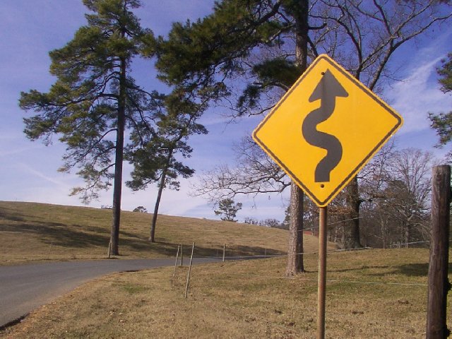
| the road and the fence leading the eye. good one |
|
|
|
04/13/2002 10:50:00 PM |
| Uh, everybody's first idea. |
|
|
|
04/13/2002 10:44:00 AM |
| Your point would be louder if you were able to show the curved road too. |
|
|
|
04/12/2002 09:39:00 PM |
| hope u dont crash into the other camera person who happens to be on the same road. |
|
|
|
04/12/2002 07:14:00 PM |
| The extra background in this works a bit better than the other similiar sign. I think the curving road in the picture is waht does it. That and the openess of the field behind the trees. Perfect location. |
|
|
|
04/11/2002 07:14:00 AM |
| lighting is flat. How would you improve that? |
|
|
|
04/10/2002 11:55:00 AM |
| I'm strangely attracted to this picture, but I'm not sure why. :) Pull that post off the right edge, it's cramped. |
|
|
|
04/10/2002 08:30:00 AM |
| Really crisp and clear background. I can almost taste the air. As far as your curves go--didn't i see that somewhere before? |
|
|
|
04/09/2002 04:09:00 PM |
| I like this one better than the other road sign here, but I think both of them could have gained something from the tall composure rather than the wide composure, with the large background space directly above or below the road sign. |
|
|
|
04/09/2002 03:26:00 PM |
| I would have like to see the road instead of the sign... pretty area :) |
|
|
|
04/09/2002 02:19:00 PM |
| The sign needs more contrast, it looks grey not balck. Apart form that the focus is excellent. |
|
|
|
04/09/2002 11:25:00 AM |
| would have gone in a lottt closer on the sign. the rest of thepic isnt asinteresting. |
|
|
|
04/09/2002 02:05:00 AM |
| another road sign! i like how you juxtapose signboard and road. can the road curve be accentuated by a higher perspective? |
|
|
|
04/08/2002 08:49:00 PM |
| I like the sign but it would have been alot better to me if you could see a little more of the road following the shape of the sign. |
|
|
|
04/08/2002 06:15:00 PM |
| Someone else has been looking over your shoulder! |
|
|
|
04/08/2002 04:03:00 PM |
| Street signs aren't interesting! Although this one's close. |
|
|
|
04/08/2002 02:57:00 PM |
| Classic sign, but perhaps it could be improved with more of the winding road in view. |
|
|
|
04/08/2002 09:39:00 AM |
| Good composition of the sign and road. A higher vantage point might have combined them even more strongly - might have needed a ladder though! |
|
|
|
04/08/2002 09:24:00 AM |
| I see your curve... I would like to see more uniqueness in your photo... |
|
|
|
04/08/2002 08:56:00 AM |
| im a sucker for road signs, but the sign is a little out of focus. |
|
|
|
04/08/2002 04:10:00 AM |
| funny idea and i like the color and compossition |
|
Home -
Challenges -
Community -
League -
Photos -
Cameras -
Lenses -
Learn -
Help -
Terms of Use -
Privacy -
Top ^
DPChallenge, and website content and design, Copyright © 2001-2026 Challenging Technologies, LLC.
All digital photo copyrights belong to the photographers and may not be used without permission.
Current Server Time: 02/01/2026 08:26:47 AM EST.