| Author | Thread |
Comments Made During the Challenge  |
|
|
04/15/2008 05:41:26 PM |
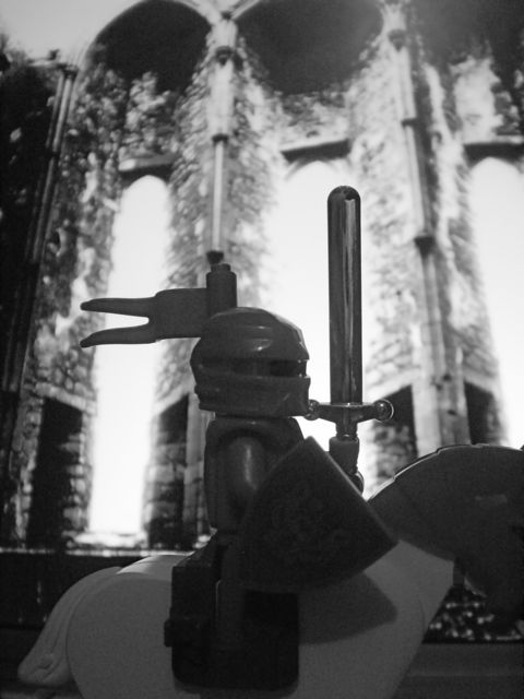
| A bit low in contrast, but I like the way you put this scene together. |
|
|
|
04/14/2008 12:19:25 PM |
| I like the idea and your background. A little more contrast and some noise reduction would have helped. |
|
|
|
04/14/2008 06:06:25 AM |
| Nice shot. Love the old rugged color |
|
|
|
04/12/2008 05:57:07 AM |
|
|
|
04/11/2008 06:19:44 AM |
| Pretty dull, and probably not the best choice for a BW. |
|
|
|
04/09/2008 06:53:05 PM |
| It's a photo of some toys. |
|
|
|
04/09/2008 06:35:13 PM |
| nice though, but just a dull photo |
|
|
|
04/09/2008 05:01:49 PM |
| The background seems way too bright compared to the dim foreground. |
|
|
|
04/09/2008 02:13:21 PM |
| Yay for Lego :) Doesn't really work for me though, no real landscape here and the overwhelming grain doesn't add anything. |
|
|
|
04/09/2008 08:26:02 AM |
| good idea, but looks too flat here, more of a 3/4 would have added drama. |
|
|
|
04/09/2008 06:08:22 AM |
| I like the concept. For me, I wish your image was a bit less grainy or maybe the little knight was more in focus. |
|
|
|
04/09/2008 04:58:28 AM |
| the composition might have been stronger if you'd chosen to shoot in landscape orientation and not cut off the horse's head ... |
|
|
|
04/08/2008 10:21:55 PM |
| this image is too dark to make an impact also most of the knight and his horse have been cut off. 5 |
|
Home -
Challenges -
Community -
League -
Photos -
Cameras -
Lenses -
Learn -
Help -
Terms of Use -
Privacy -
Top ^
DPChallenge, and website content and design, Copyright © 2001-2025 Challenging Technologies, LLC.
All digital photo copyrights belong to the photographers and may not be used without permission.
Current Server Time: 04/07/2025 01:55:28 PM EDT.