| Author | Thread |
|
|
05/14/2008 04:30:40 AM |
Well I was one of your 55 6's.
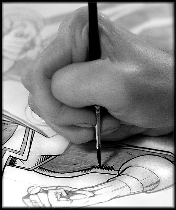
I really liked the mirrored differences of the two hands in the shot, together with the fact that this was definitely a hand at work rather than posed in a studio. The tonal range on the cartoon is strong and the sharpness is wonderfully crisp. The human hand is slightly softer by comparison and (for me) that was the difference between a 6 and an 8 or 9. (I may have also cropped a little tighter)
There is a great tutorial on Black and White conversions on the site which might me useful
//www.dpchallenge.com/tutorial.php?TUTORIAL_ID=43
Another couple of thoughts
Firstly there is a great free download filter for black and white conversions called optik verve
I would emphasise that these are relatively minor points and my overall impression was that this is a really nice picture and very good for the challenge
J |
|
 Photographer found comment helpful. Photographer found comment helpful. |
|
|
04/20/2008 08:14:40 AM |
| I didn't vote in this challenge. I was just browsing and stumbled on your photo. I think it is very nice and I like the B/W tones. Some say the hand should be in focus and maybe that would have helped the score but I like where you have the focus. I think it is a great moment you have captured for your friend. You may want to consider printing and framing this for your friend. Revisit this and focus on the hand to see if it would make a difference. In my opinion it is the moment you have captured that counts. Nicely done for your first challenge. |
|
| Photographer found comment helpful. |
|
|
04/16/2008 11:16:53 AM |
| I agree with most of the comments - I would like to have seen the hand a bit more in focus. I like the contrast of the lower part of the photo and would even consider cropping it half way up the thumb. The top of the photo doesn't add much in my opinion. Just my 2cents. |
|
| Photographer found comment helpful. |
|
|
04/14/2008 12:28:11 AM |
| I do hope that those who voted 2's and 3's on mine will please have the courtesy to send me a PM as to what i could improve or what their rating system is based on? critique welcome= |
|
Comments Made During the Challenge  |
|
|
04/12/2008 09:57:16 PM |
|
| Photographer found comment helpful. |
|
|
04/12/2008 01:46:23 AM |
| For the challenge I would have liked to see the hand in focus, not the paint brush... |
|
| Photographer found comment helpful. |
|
|
04/11/2008 01:02:48 AM |
| I like the composition of this image. |
|
| Photographer found comment helpful. |
|
|
04/10/2008 09:05:08 AM |
| I really like your photograph. I don't think others will have it as highly rated as I do, but I teach art at a high school so this is an image I can certainly connect with. I like that the focus is right at the tips of the fingers and where the brush meets the paper. My colleague teaches cartooning and animation and he, too liked your photo. |
|
| Photographer found comment helpful. |
|
|
04/09/2008 11:01:06 PM |
| Nice image - Maybe a slightly better part of the image he is working on could have held our attention a little more? |
|
| Photographer found comment helpful. |
|
|
04/09/2008 08:04:31 PM |
| I lose the upper half of the hand in the background a little. |
|
| Photographer found comment helpful. |
|
|
04/08/2008 08:50:38 AM |
| I would have like to have the hand in focus and not the drawing. |
|
| Photographer found comment helpful. |
|
|
04/07/2008 08:22:02 AM |
| I would like the hand in focus rather than the artwork. |
|
| Photographer found comment helpful. |
|
|
04/07/2008 12:40:25 AM |
| a bit noisy/grainy in parts. |
|
| Photographer found comment helpful. |
Home -
Challenges -
Community -
League -
Photos -
Cameras -
Lenses -
Learn -
Help -
Terms of Use -
Privacy -
Top ^
DPChallenge, and website content and design, Copyright © 2001-2026 Challenging Technologies, LLC.
All digital photo copyrights belong to the photographers and may not be used without permission.
Current Server Time: 02/01/2026 10:48:08 AM EST.