| Author | Thread |
|
|
04/19/2008 06:47:33 PM |
| Excellent shot, congrats! |
|
 Photographer found comment helpful. Photographer found comment helpful. |
|
|
04/16/2008 02:33:54 PM |
| Great composition! This is beautiful! |
|
| Photographer found comment helpful. |
|
|
04/16/2008 10:07:34 AM |
Ohmy! I'm really surprised this one didn't ribbon. This is so unique and striking. Beautiful, dramatic work as always!
|
|
| Photographer found comment helpful. |
|
|
04/16/2008 09:23:32 AM |
| I didn't cast my vote in the challenge. But this is wicked good. 'grats. |
|
| Photographer found comment helpful. |
|
|
04/16/2008 08:43:44 AM |
| great score, joe - sucks you didn't make top 10 |
|
| Photographer found comment helpful. |
|
|
04/16/2008 12:30:48 AM |
| top 20, awesome work. I actually agree with zeus in that it appears a tad flat on my screen, but still, a tremendous image to look at, especially for this challenge |
|
| Photographer found comment helpful. |
Comments Made During the Challenge  |
|
|
04/14/2008 11:58:53 PM |
|
| Photographer found comment helpful. |
|
|
04/14/2008 11:24:32 PM |
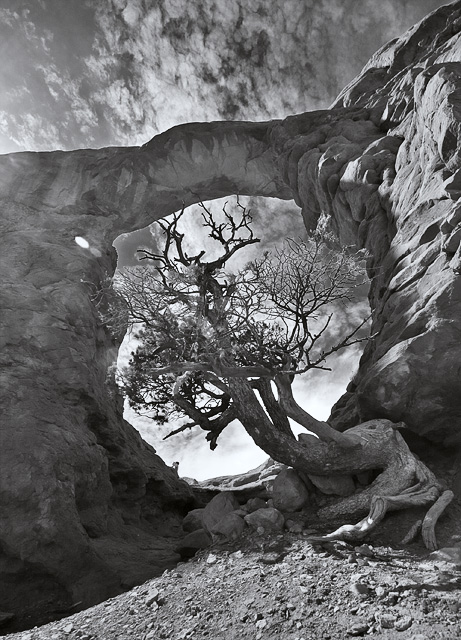
Energy/Range/Story: 6/6/7
Composition/perspective/manner: 6/6/5
Aesthetics/Technical:6/4
Presentation: 6
Total:5.8
Vote: 6
Remarks: It appears as if much contrast has been sacrificed, perhaps, in order to contain the highlights. While we have discernible detail in the shadows, the writing of time and weather, unfortunately, appears awash and a little flat.
I would love to see this shot revisited and revised with a little time and care, as it has in it, IMO, the potential for a great and enduring photograph. |
|
| Photographer found comment helpful. |
|
|
04/13/2008 03:23:59 AM |
| really nice...there is a bit of flare there, but that's OK...8 |
|
| Photographer found comment helpful. |
|
|
04/12/2008 07:21:57 PM |
| Love how this is framed... |
|
| Photographer found comment helpful. |
|
|
04/11/2008 12:02:59 PM |
| I think a little more contrast will really make it pop. Beautiful image nevertheless! |
|
| Photographer found comment helpful. |
|
|
04/11/2008 11:04:15 AM |
| I'd like to see more contrast - perhaps the arch could be darker. |
|
| Photographer found comment helpful. |
|
|
04/11/2008 05:58:55 AM |
| Excellent subject and composition, both for this challenge and for a very good picture. |
|
| Photographer found comment helpful. |
|
|
04/10/2008 08:18:18 PM |
| Well composed to include the natural frame. Good light and tones. |
|
| Photographer found comment helpful. |
|
|
04/10/2008 03:12:46 PM |
| very nice, the only part i dislike is the washed out section of the rock on the far left, top |
|
| Photographer found comment helpful. |
|
|
04/10/2008 02:58:56 PM |
|
| Photographer found comment helpful. |
|
|
04/09/2008 09:08:34 PM |
| What a fantastic sky, nice framing too. |
|
| Photographer found comment helpful. |
|
|
04/09/2008 06:25:36 PM |
| Great shot!! I love it a lot. |
|
| Photographer found comment helpful. |
|
|
04/09/2008 11:46:53 AM |
| creative aproach! Now the tree is in the center twice! :) |
|
| Photographer found comment helpful. |
|
|
04/09/2008 11:20:12 AM |
|
| Photographer found comment helpful. |
|
|
04/09/2008 11:00:56 AM |
| Good use of framing. A very interesting shot overall. |
|
| Photographer found comment helpful. |
|
|
04/09/2008 07:56:10 AM |
| Some really interesting shapes here :D |
|
| Photographer found comment helpful. |
Home -
Challenges -
Community -
League -
Photos -
Cameras -
Lenses -
Learn -
Help -
Terms of Use -
Privacy -
Top ^
DPChallenge, and website content and design, Copyright © 2001-2026 Challenging Technologies, LLC.
All digital photo copyrights belong to the photographers and may not be used without permission.
Current Server Time: 02/01/2026 12:03:38 PM EST.