| Author | Thread |
|
|
04/10/2008 01:42:27 PM |
| Hooray! My best scoring picture so far! I'm so excited to be in the top 20 and can't believe it. Also my first 6+ but hopefully to be followed by many more. Thanks for the votes and the comments! |
|
Comments Made During the Challenge  |
|
|
04/08/2008 07:30:29 PM |
|
 Photographer found comment helpful. Photographer found comment helpful. |
|
|
04/08/2008 07:34:00 AM |
|
| Photographer found comment helpful. |
|
|
04/07/2008 06:21:27 PM |
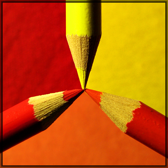
| Interesting! Too bad the orange pencil looks so similar to the red and isn't entirely hiding the yellow. |
|
| Photographer found comment helpful. |
|
|
04/07/2008 04:21:37 PM |
| You've got a little yellow seeping out under the orange pencil. |
|
| Photographer found comment helpful. |
|
|
04/07/2008 12:54:19 PM |
| very creative and nice color |
|
| Photographer found comment helpful. |
|
|
04/05/2008 09:57:45 AM |
| Very well done. I happened along this tutorial today actually. I would have liked to see more of a difference between the red and orange pencils though. But I know how hard these colours can be to photograph together. Also, the same amount of shadow on the orange pencil as on the others, would have balanced it out even more. 9.4 |
|
| Photographer found comment helpful. |
|
|
04/04/2008 08:30:57 PM |
| very nice, I like the symmetry. |
|
| Photographer found comment helpful. |
|
|
04/04/2008 06:35:34 PM |
| Wow. Creative and cool. Great colors. You clearly "tri-ad" hard --- and it was worth the effort. |
|
| Photographer found comment helpful. |
|
|
04/04/2008 06:44:23 AM |
I'd love to see your setup for how you blurred the background. I tried something similar w/ colored bencils, and I wasn't either as well focused as you, or you have a macro lens. I'd be happy if you didn't, because that means I can do something similar!
If you were to print this, I'd clone out that tiny yellow spot under the orange pencil.
Good job on the theme and composition, although I just noticed you'll probably get DQ'd because of your border. A shame! |
|
| Photographer found comment helpful. |
|
|
04/03/2008 02:37:08 PM |
| A great concept and a well executed image but I don't feel your border adds anything to the finished product. |
|
| Photographer found comment helpful. |
|
|
04/03/2008 12:41:44 PM |
| very nice concept but execution wise a bit more dof (to get complete pencils in focus) could have helped. also multiple light sources could have avoided the harsh shadow too. 6 for the concept and effort |
|
| Photographer found comment helpful. |
|
|
04/02/2008 09:13:28 AM |
| I like the idea. Maybe a square crop without the extra orange border? Maybe a tilt? |
|
| Photographer found comment helpful. |
|
|
04/02/2008 12:53:50 AM |
| "Tri-ad" would have been plenty for a title. |
|
| Photographer found comment helpful. |
Home -
Challenges -
Community -
League -
Photos -
Cameras -
Lenses -
Learn -
Help -
Terms of Use -
Privacy -
Top ^
DPChallenge, and website content and design, Copyright © 2001-2025 Challenging Technologies, LLC.
All digital photo copyrights belong to the photographers and may not be used without permission.
Current Server Time: 04/08/2025 03:24:17 AM EDT.