| Author | Thread |
Comments Made During the Challenge  |
|
|
03/30/2004 07:20:40 AM |
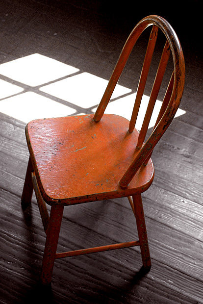
| The title tries to do too much. You have a beautiful, simple shot here. Well done. |
|
|
|
03/29/2004 10:08:50 AM |
| They do this in yellow too!. Very nice shot |
|
|
|
03/27/2004 08:40:34 AM |
| very elegent....well done |
|
|
|
03/26/2004 09:16:26 AM |
| Great composition. The light on the floor almost looks like white pieces of paper set there. I like this a lot. |
|
|
|
03/26/2004 04:25:47 AM |
| simple and direct. i like this! |
|
|
|
03/26/2004 04:16:44 AM |
| The bright patch in the background is very distracting, which is a pity because this could be a very good picture. |
|
|
|
03/24/2004 03:27:13 PM |
| What a great shot. The lines are perfect with the wood grain, the chair position and the window light. It works very well ! |
|
|
|
03/24/2004 01:31:45 PM |
| I like the sun coming in through the window with the light on the floor...but it's overdone - too bright. I would have liked to have seen more light on the chair, and less emphasis on the sunlight. |
|
|
|
03/24/2004 12:43:28 PM |
| I used to have that same chair, but in green and with at least 5 coats of paint on it..lol Love this shot. I do think it could be a bit more crisp/sharp. Good entry, and a good over all feel to this shot. |
|
|
|
03/24/2004 12:28:20 PM |
| Did you try putting the chair in the light? I find the pattern of light distracting and a bit blown out, I would either use it or lose it. |
|
|
|
03/23/2004 09:05:43 PM |
|
Home -
Challenges -
Community -
League -
Photos -
Cameras -
Lenses -
Learn -
Help -
Terms of Use -
Privacy -
Top ^
DPChallenge, and website content and design, Copyright © 2001-2025 Challenging Technologies, LLC.
All digital photo copyrights belong to the photographers and may not be used without permission.
Current Server Time: 04/07/2025 12:59:03 PM EDT.