| Author | Thread |
Comments Made During the Challenge  |
|
|
04/08/2008 07:37:09 PM |
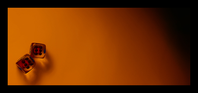
| perfect warm colored composition..... |
|
 Photographer found comment helpful. Photographer found comment helpful. |
|
|
04/07/2008 06:26:32 PM |
| a unique composition. A little brighter might have been good, but that's more of a nitpick than a real critique. |
|
| Photographer found comment helpful. |
|
|
04/06/2008 06:12:31 AM |
| too small, flat light, hard to see the dice, too dark, overall good colors (hues) but that's it |
|
| Photographer found comment helpful. |
|
|
04/05/2008 05:38:49 PM |
| I really love this composition, the panoramic crop really works as does the gradual change in tones. |
|
| Photographer found comment helpful. |
|
|
04/04/2008 08:31:45 AM |
| I'm not particularly thrilled about this image, but at least your presentation and the gradient like background is unique, so kudos for that. |
|
| Photographer found comment helpful. |
|
|
04/03/2008 02:52:20 PM |
| A good idea however I feel that your border is a little too thick. |
|
| Photographer found comment helpful. |
|
|
04/03/2008 10:44:21 AM |
| Perhaps I just don't get it, but if the dice edges were crisper it might make a nice poster. |
|
| Photographer found comment helpful. |
|
|
04/02/2008 06:33:42 PM |
| I like this one a lot, sutile, simple and sexy! |
|
| Photographer found comment helpful. |
|
|
04/01/2008 11:00:46 PM |
| nice concept. but love a little more of play with lighting |
|
| Photographer found comment helpful. |
Home -
Challenges -
Community -
League -
Photos -
Cameras -
Lenses -
Learn -
Help -
Terms of Use -
Privacy -
Top ^
DPChallenge, and website content and design, Copyright © 2001-2025 Challenging Technologies, LLC.
All digital photo copyrights belong to the photographers and may not be used without permission.
Current Server Time: 04/08/2025 03:23:59 AM EDT.