| Author | Thread |
|
|
04/02/2008 06:16:31 AM |
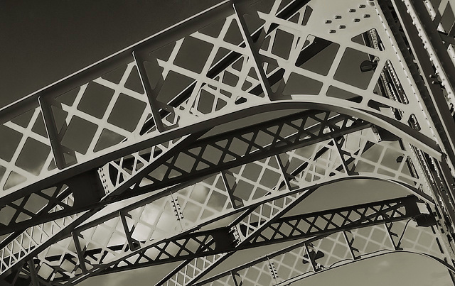
| Lovely shot. I like the cloud, which seems like a whimsical intrusion into your idea. |
|
 Photographer found comment helpful. Photographer found comment helpful. |
|
|
04/02/2008 05:39:25 AM |
| I did give this a 6 for the beautiful mix of pattern, light and shadow. I'm thinking that the reason why I did not give this a higher score was because of the color tone. Have you tried this in just pure black and white? |
|
| Photographer found comment helpful. |
|
|
04/02/2008 04:19:30 AM |
| I love that someone described this as distracting, lol. It should distract you, it should keep you busy examining it and finding all it conceals. I love this, really. There are many, many patterns here and they are all interesting. |
|
| Photographer found comment helpful. |
|
|
04/02/2008 03:30:55 AM |
| You got a very good score from me on this one - I quite agree with your assessment of the light and pattern play of the lights against the darks and vice versa. And in fact, the longer I look at it, the more I like it, too. As for the score? I dunno - maybe too busy? Some might not like the tilt - that's a love or hate kinda thing with some people. You do have some good comments as to why some people didn't care for it as much. I'd consider that a success in a challenge, by the way. Glad you're pleased with it and that it came out the way you wanted it to. That is also a success! |
|
| Photographer found comment helpful. |
Comments Made During the Challenge  |
|
|
03/31/2008 06:46:48 PM |
| A nice idea for a picture, but the emptiness in the upper left bothers me a little. |
|
| Photographer found comment helpful. |
|
|
03/31/2008 04:50:40 PM |
| The values in this picture are kind of odd. |
|
| Photographer found comment helpful. |
|
|
03/31/2008 08:43:43 AM |
| I'm not sure why this seems odd to me. I'm not a photog so I suggest sending this to the critique club for advice. |
|
| Photographer found comment helpful. |
|
|
03/31/2008 04:23:51 AM |
|
| Photographer found comment helpful. |
|
|
03/29/2008 08:43:30 AM |
|
| Photographer found comment helpful. |
|
|
03/27/2008 12:42:23 PM |
| I like the abstract architecture, but I think this may be a better shot on either a completely clear, or completely overcast day, as the clouds in the lower left kinda break up the pattern. |
|
| Photographer found comment helpful. |
|
|
03/27/2008 05:52:24 AM |
| monotone, but it works. a strong pattern at a nice twisted angle. |
|
| Photographer found comment helpful. |
|
|
03/26/2008 06:08:59 PM |
| nice composition and interesting choice of subject. I'd have liked it more with a bit higher contrast, I think. |
|
| Photographer found comment helpful. |
|
|
03/26/2008 12:40:41 PM |
|
| Photographer found comment helpful. |
|
|
03/26/2008 11:50:14 AM |
| good way to show off the bones of this bridge, light good except that section near the middle. |
|
| Photographer found comment helpful. |
|
|
03/26/2008 07:01:53 AM |
| I like the angle but it seems like it is dull and washed out |
|
| Photographer found comment helpful. |
|
|
03/26/2008 05:39:32 AM |
| I like the dimond pattern that you decided to go with, but you could of focused on one rather then have a ton that can be distracting |
|
| Photographer found comment helpful. |
Home -
Challenges -
Community -
League -
Photos -
Cameras -
Lenses -
Learn -
Help -
Terms of Use -
Privacy -
Top ^
DPChallenge, and website content and design, Copyright © 2001-2025 Challenging Technologies, LLC.
All digital photo copyrights belong to the photographers and may not be used without permission.
Current Server Time: 04/07/2025 06:00:36 AM EDT.