| Author | Thread |
Comments Made During the Challenge  |
|
|
04/05/2008 09:49:10 AM |
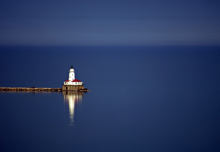
| Ahh yes simple yet effective. I love that blue and how it meets the horizon. Great transition. niner |
|
 Photographer found comment helpful. Photographer found comment helpful. |
|
|
04/04/2008 06:58:20 PM |
| Nice use of the negative space, but I think you should have cropped it a little lower int he frame. It just seems a little awkward to me where it is in the frame. |
|
|
|
04/04/2008 05:47:24 PM |
|
| Photographer found comment helpful. |
|
|
04/04/2008 01:06:53 AM |
| Really nice! Love the white against the blue. |
|
| Photographer found comment helpful. |
|
|
04/03/2008 02:36:29 AM |
| I really love the simplicity of this |
|
| Photographer found comment helpful. |
|
|
04/02/2008 01:44:53 PM |
| Beautiful shot. I like the simplicity. |
|
| Photographer found comment helpful. |
|
|
04/02/2008 07:41:36 AM |
|
| Photographer found comment helpful. |
|
|
04/01/2008 09:28:57 AM |
| I really like this pic, but I wish maybe the lighthouse were just a bit more crisp. I love the setup of the shot though and the overall image really catches my eye. I think you may be on to something here. |
|
|
|
03/31/2008 09:03:51 PM |
| Bit out of focus perhaps, I would have cropped it to put the lighthouse bottom left? |
|
Home -
Challenges -
Community -
League -
Photos -
Cameras -
Lenses -
Learn -
Help -
Terms of Use -
Privacy -
Top ^
DPChallenge, and website content and design, Copyright © 2001-2025 Challenging Technologies, LLC.
All digital photo copyrights belong to the photographers and may not be used without permission.
Current Server Time: 04/08/2025 04:15:39 PM EDT.