| Author | Thread |
Comments Made During the Challenge  |
|
|
03/28/2004 04:26:52 PM |
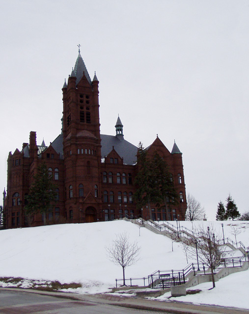
| The darkness of the building doesn't do it justice. For an architectural magazine I would expect the shot to highlight & emphasize the beauty of the building. In this shot I'm more drawn to the angles of the steps |
|
 Photographer found comment helpful. Photographer found comment helpful. |
|
|
03/26/2004 06:08:18 PM |
| Good subject & composition. Better weather would be the key thing to improve here. Outside of that, the best you can do is burn the sky & snow and dodge the building in Photoshop to bring out the details |
|
| Photographer found comment helpful. |
|
|
03/25/2004 12:49:21 PM |
| Converging verticals are a problem here, fortunately this can now be corrected with the new rules as far as I'm aware. The overal shot is almost pretty good, but making all the elements of the building parallel would make it much more professional. Snow is tricky to expose for, and the building is underexposed. IMO the picture would be much better without the road in the foreground. I know that you can use the empty sky to place text and such into for your magazine cover, but as a photo I would have liked some texture in there, for example some clouds. I love the jagged path in this composition. |
|
| Photographer found comment helpful. |
|
|
03/23/2004 04:09:07 PM |
| Too dark. The importance of an architectural magazine is the architecture. Too much foreground. Getting closer to the building and showing more detail would help. There is a little bit of converging vertical lines. |
|
| Photographer found comment helpful. |
|
|
03/23/2004 08:07:03 AM |
| Bad light on the building. We can blame it on the snow :( I think this could be better subject in more dark |
|
| Photographer found comment helpful. |
|
|
03/23/2004 06:07:40 AM |
| The contrast seems to drowned some of the detail. |
|
| Photographer found comment helpful. |
|
|
03/22/2004 07:08:12 PM |
| a difficult subject to meter on.... |
|
| Photographer found comment helpful. |
|
|
03/22/2004 07:02:34 PM |
| maybe it's an optical illusion but this looks a bit lobsided. |
|
| Photographer found comment helpful. |
|
|
03/22/2004 02:55:20 PM |
| I think this shot would have benefitted from a tighter crop on the building (to elimiinate the street and patch of thawed ground) and rotating it a little to the right so the tower is straight up. It feels off-balance in this composition. |
|
| Photographer found comment helpful. |
|
|
03/22/2004 01:18:30 PM |
| wish I could see the detail in the church |
|
| Photographer found comment helpful. |
|
|
03/22/2004 12:36:20 PM |
| Ouch! I though it's two images... The scene is super but the castle is little too dark. |
|
| Photographer found comment helpful. |
|
|
03/22/2004 12:36:18 PM |
| I would have liked to see more detail on the building, just a bit too dark |
|
| Photographer found comment helpful. |
|
|
03/22/2004 06:06:39 AM |
| Excellent shot but it looks like its kinda leaning to the left. |
|
| Photographer found comment helpful. |
|
|
03/22/2004 03:09:36 AM |
| Great idea, but seems a touch underexposed... I'm left wanting to see more details of the incredible building. |
|
| Photographer found comment helpful. |
|
|
03/22/2004 02:24:35 AM |
| Nice idea, but the exposure isn't "rich" enought looking for most magazines I've seen. Needs more detail. |
|
| Photographer found comment helpful. |
|
|
03/22/2004 02:00:26 AM |
| interesting but i feel the building itself is too dark and loses the details of the architecture. |
|
| Photographer found comment helpful. |
Home -
Challenges -
Community -
League -
Photos -
Cameras -
Lenses -
Learn -
Help -
Terms of Use -
Privacy -
Top ^
DPChallenge, and website content and design, Copyright © 2001-2025 Challenging Technologies, LLC.
All digital photo copyrights belong to the photographers and may not be used without permission.
Current Server Time: 04/12/2025 12:32:44 AM EDT.