| Author | Thread |
|
|
03/24/2008 12:47:18 AM |
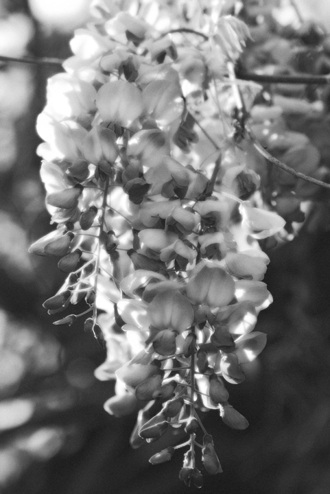
| I really like the softness and grayness of this - I can almost smell it. I disagree that it needs more contrast - to me it doesn't. That paleness adds to the gentle feel of the shot to me. |
|
 Photographer found comment helpful. Photographer found comment helpful. |
|
|
03/18/2008 08:15:24 PM |
| I like the softness of this, but maybe could use just a tad more contrast. I think it's very interesting to take a subject that is normally photographed for it's color, and turn it into a black and white. It makes you look beyond the color to textures, shapes, and other detail that you might normally miss. I like it in black and white. |
|
| Photographer found comment helpful. |
|
|
03/15/2008 04:45:58 PM |
I love the diffused glow look in photos. It makes them so soft and pretty. Especially in black and white! Awesome job, Germaine.
|
|
| Photographer found comment helpful. |
|
|
03/14/2008 07:31:42 PM |
It almost has a 3d look to it. I keep wanting the flowers to be a little more crisp. However, the most common comment I get in challenges is, "over sharpened".
|
|
| Photographer found comment helpful. |
|
|
03/13/2008 11:48:13 PM |
| This seems a bit flat, maybe a bit more contrast would be helpful. |
|
| Photographer found comment helpful. |
|
|
03/13/2008 06:58:44 AM |
It's a beautiful flower. And you've got a great pattern and texture here. I prefer the color versions, but that's just me. It's a shame to erase all that eye-popping color from the original.
A little more contrast would be nice, but I'd be afraid that it would blow out the bright spots in the flowers. Maybe just a darkening of the shadows to get some deeper blacks would be enough. |
|
| Photographer found comment helpful. |
|
|
03/12/2008 07:31:37 PM |
| I really like how that diffuse glow adds a dreamy effect to this. The bokeh seems to point right to the flower, if that makes sense. Before I read the comment below I also wondered how a bit more contrast would make this look. |
|
| Photographer found comment helpful. |
|
|
03/12/2008 09:23:37 AM |
| nice shot, i think a boost in contrast could really help, seems a bit grey |
|
Home -
Challenges -
Community -
League -
Photos -
Cameras -
Lenses -
Learn -
Help -
Terms of Use -
Privacy -
Top ^
DPChallenge, and website content and design, Copyright © 2001-2025 Challenging Technologies, LLC.
All digital photo copyrights belong to the photographers and may not be used without permission.
Current Server Time: 04/12/2025 10:34:49 AM EDT.