| Author | Thread |
|
|
04/15/2002 06:22:00 PM |
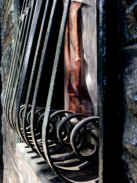
| Thanks all. I agree with Corey-this would've been much better in black and white. Mykoleary...I don't see a cat, do you, ha? Sonifo, I don't think anybody's peeking out. It's just some curtains, I think. I didn't really look beyond the bars, heh. |
|
Comments Made During the Challenge  |
|
|
04/14/2002 09:09:00 PM |
|
|
|
04/14/2002 10:31:00 AM |
| the surrounding brick is a nice touch as well as the angle. |
|
|
|
04/12/2002 02:23:00 PM |
| Good framing. Is that a cat in the window?? |
|
|
|
04/11/2002 02:15:00 PM |
|
|
|
04/11/2002 12:48:00 PM |
| the curves are pushing off to the side of the frame, it would feel more balanced if they were leading to the center of the image. |
|
|
|
04/10/2002 06:20:00 PM |
|
|
|
04/09/2002 05:32:00 PM |
|
|
|
04/09/2002 03:37:00 PM |
| Is that a window and is someone peaking out? It took me awhile to figure out what it was. Great picture. :) |
|
|
|
04/09/2002 01:13:00 PM |
|
|
|
04/09/2002 12:22:00 PM |
| Nice and crisp shot, fine technically. Not my choice of subject though. To me it doesn't instantly pop out and say anything. I don't feel any emotion with it. |
|
|
|
04/09/2002 11:37:00 AM |
| Nice idea. I like the picture, but the colors are distracting, and that can't really be helped :( |
|
|
|
04/09/2002 11:12:00 AM |
| youve done a good job iwth the exposure and focus. i would go in closer tho on the rails themselves. |
|
|
|
04/09/2002 02:35:00 AM |
| Nice repetition, but the eye is drawn more to the copper-colour behind, rather than the ironwork. |
|
|
|
04/08/2002 08:38:00 PM |
| I think this shot would have been alot better in B+W, the colors in the window are a little distracting, also a different time of day might have been better, looks like around noon, late afternoon or early morning would have reduced the harshness of the light. |
|
|
|
04/08/2002 04:11:00 PM |
| Nice use of the vertical frame. |
|
|
|
04/08/2002 01:07:00 PM |
| These are some interesting pieces of architecture... I like the shadows as well... |
|
|
|
04/08/2002 09:50:00 AM |
| good composition, bit too tight on the bottom though. good subject and lighting |
|
Home -
Challenges -
Community -
League -
Photos -
Cameras -
Lenses -
Learn -
Help -
Terms of Use -
Privacy -
Top ^
DPChallenge, and website content and design, Copyright © 2001-2026 Challenging Technologies, LLC.
All digital photo copyrights belong to the photographers and may not be used without permission.
Current Server Time: 02/01/2026 06:54:44 AM EST.