| Author | Thread |
|
|
04/01/2004 03:48:39 PM |
Hello Bobster welcome to photoholic anomous where your photography bug gets smashed by people who don't know shit about photography and don't take the time to actually look at the work.
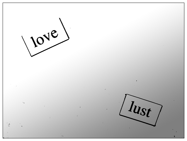
I think I understand what you were doing with the lighting in your image by making lust dark and love lighter brighter but I think something seems missing. I think there is a visual element something more that you should have really added to pull the image into something that is more well fulfilling. The negative space does help the image out to much also maybe having an black box completely surrounding love would be big help in defining more space where the lighting gets blown out.
Oh it is those little word magnets how wonderful. You know I kind of like your black specs in the image I wish there was more like them so you could tell or believe it might be a dirty refrigerator the decay of love the corrusion of love and lust! Yes Yes your wild antics are beautiful just more thought and you will have something wonderful work through your problems don't stop make more work expand this ideas!!!!!!!!! |
|
 Photographer found comment helpful. Photographer found comment helpful. |
|
|
03/29/2004 01:13:06 PM |
Welcome back Bob!
Havent seen ya in awhile.. |
|
| Photographer found comment helpful. |
|
|
03/28/2004 08:42:51 PM |
| Thanks to those that took the time to appreciate this picture. While I know it's not for everyone, I've never received so many unhelpful and ignorant comments on a shot. |
|
|
|
03/28/2004 07:30:47 PM |
| I stayed long enough to talk myself into giving you an 8. I like it. Sorry it didn't finish higher. |
|
| Photographer found comment helpful. |
Comments Made During the Challenge  |
|
|
03/26/2004 02:12:54 PM |
|
|
|
03/25/2004 06:35:12 PM |
| Hmm... not much of a photo I'm afraid. While the image might be appropriate for this magazine, it's unlikely that any designer would hire a photographer to shoot something so easily rendered by computer. Now print those same words on acetate and shoot them over an interesting background and you might have a winner. |
|
|
|
03/25/2004 12:48:24 PM |
I don't know, but this seems to be typed words on some paper. If they are those little magnets, there isn't a way for me to tell because the lighting is so flat. The spots all over could have been cloned out for the challenge, unless you are making some statement about how love is dirty business. Sorry to sound so negative. A major headache with digital photos is all the dust on the sensor. OK, maybe you are saying love is pure and lust is dirty, but there has to be a better way to get the point across.
Sorta like one of those ink blot tests? I'm beginning to like this one. Will come back to see the comments. |
|
| Photographer found comment helpful. |
|
|
03/25/2004 08:31:11 AM |
| I don't really understand this. a little untidy. |
|
|
|
03/23/2004 04:16:34 AM |
| Good simplicity and contrast. I like the dirty look--very journalistic. It's not oriented for a mag cover, but i really like it. 9 |
|
| Photographer found comment helpful. |
|
|
03/23/2004 12:10:39 AM |
(I'm writing this to everyone who submitted a landscape shot) The challenge was to produce a shot worthy of a magazine cover but to me a shot like this is not suitable to be put on a "portrait" format magazine.
Is that fridge magnet poetry? Nice idea, not sure about the contrast editing though
---ADDITIONAL---
Due to forum discussions and accusations that marking landscapes down is nitpicking, I'm going through them and remarking. I still think some of the landscapes would not make good covers because of their orientation but I am no longer marking down because of that.
I still think landscape is inapropriate for the majority of magazines but I'll give the benefit of the doubt to the photographers. |
|
|
|
03/22/2004 07:42:52 PM |
|
|
|
03/22/2004 10:11:09 AM |
| I had a quick look on the internet but couldn't find "poetry magazine". Interesting shot anyhow but I'm marking all "landscape" shots a point lower as I don't believe they fit the challenge parameters. |
|
|
|
03/22/2004 05:08:48 AM |
| I don't think I would find this cover appealing, looking over a magazine rack. It's not eyecatching, and it's not intriguing. Points for trying something different, but the black "flecks" and the overall shot just really don't appeal to me. |
|
| Photographer found comment helpful. |
|
|
03/21/2004 08:18:31 PM |
Your black speckles through this shot are very distracting and very easy to deal with in the advanced editing rules. I'm confused as to why you would leave them in. Overall the shot doesn't have much interest or staying power.
TC |
|
| Photographer found comment helpful. |
Home -
Challenges -
Community -
League -
Photos -
Cameras -
Lenses -
Learn -
Help -
Terms of Use -
Privacy -
Top ^
DPChallenge, and website content and design, Copyright © 2001-2025 Challenging Technologies, LLC.
All digital photo copyrights belong to the photographers and may not be used without permission.
Current Server Time: 04/08/2025 01:31:55 AM EDT.