| Author | Thread |
|
|
03/16/2008 03:52:00 PM |
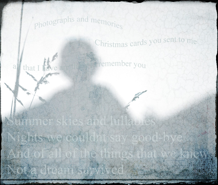
Another fantastic pairing by Jutilda! I understand what they were saying about the upright font. But you know I think it really works well.
The swaying texture of the font pulls it through. And I especially like the uneven-ness of the placement of the text ... that makes it a true artistic piece. |
|
 Photographer found comment helpful. Photographer found comment helpful. |
|
|
03/10/2008 04:02:27 PM |
| Love the hazed effect of the overlay. I used to listen to Jim Croce for hours on end. (sigh) |
|
| Photographer found comment helpful. |
|
|
03/10/2008 07:14:27 AM |
lovely one judy, is it just me, but i sometimes think the first four lines would suffice?
(maybe i'm just a lazy reader) and a pleb. :p |
|
| Photographer found comment helpful. |
|
|
03/10/2008 06:45:58 AM |
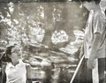
| the photo is a stunner, truly a stunner. i agree with gnarf, though - the font really doesn't work with this image or these words; it's just too stiff and upright. i think a cursive font would work better. |
|
| Photographer found comment helpful. |
|
|
03/09/2008 07:25:43 PM |
oh oh I think  Gnarf you got the wrong thread...Judy, I think you should write a poem about this ;) hey, and put it on a photo :) Gnarf you got the wrong thread...Judy, I think you should write a poem about this ;) hey, and put it on a photo :)
Message edited by author 2008-03-09 19:27:09. |
|
| Photographer found comment helpful. |
|
|
03/09/2008 04:17:44 PM |
| i really dont like the font , and generally dont like text on a photo. but i do like the photo :() |
|
Home -
Challenges -
Community -
League -
Photos -
Cameras -
Lenses -
Learn -
Help -
Terms of Use -
Privacy -
Top ^
DPChallenge, and website content and design, Copyright © 2001-2026 Challenging Technologies, LLC.
All digital photo copyrights belong to the photographers and may not be used without permission.
Current Server Time: 02/01/2026 08:55:10 AM EST.