| Author | Thread |
|
|
10/02/2007 04:23:44 PM |
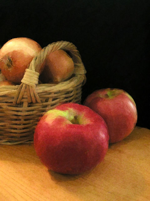
| So pretty - The filter works so well here, creating a classy, painting-like effect. The warm colors, intricate lighting, and textures create a lovely still-life. :) |
|
|
|
03/29/2004 11:37:16 AM |
| Nice still life. I wouldnt mind seeing it prior to the filter, but looks great as is. |
|
 Photographer found comment helpful. Photographer found comment helpful. |
|
|
03/29/2004 04:06:28 AM |
Lovely piece of "art".
This sort of work is never appreciated the way it should be.
Well done.
Gordon |
|
| Photographer found comment helpful. |
Comments Made During the Challenge  |
|
|
03/27/2004 04:50:47 PM |
| Wow, love the effects you've put on this. 8 |
|
| Photographer found comment helpful. |
|
|
03/26/2004 06:55:14 PM |
| Yes, I could easily see this on a magazine cover. The painterly effect is overdone for me, though (this site is, after all, about photography- not painting). The same shot without the effects would probably score much higher (particularly with dramatic lighting). |
|
| Photographer found comment helpful. |
|
|
03/26/2004 03:01:25 PM |
| Hope you don't get burned too much for using a "creative" filter. I like it and I think it could work as a magazine cover. |
|
| Photographer found comment helpful. |
|
|
03/26/2004 12:08:04 PM |
| Nice shot, and a good magazine cover, with a vertical format and space at the top that could carry type without spoiling the picture. |
|
| Photographer found comment helpful. |
|
|
03/25/2004 07:56:56 PM |
| I don't know whether you deliberately went for an arty look of if this just comes from over-compression, but it looks good. |
|
| Photographer found comment helpful. |
|
|
03/24/2004 08:12:08 PM |
| Very nice lighting & composition, and I absolutely love the use of PS (or equivalent) to give it a painted look. Very natural, not overdone. Kudos. |
|
| Photographer found comment helpful. |
|
|
03/24/2004 07:20:55 PM |
|
| Photographer found comment helpful. |
|
|
03/24/2004 03:45:32 PM |
| Lovely shot and really nice use of "artistic" filter. Great composition and colour too. The negative space you have left for magazine title and features text is intelligent and well placed. |
|
| Photographer found comment helpful. |
|
|
03/23/2004 08:59:56 PM |
| I like the graininess of this shot. Composition leaves room for text. |
|
| Photographer found comment helpful. |
|
|
03/22/2004 11:06:15 PM |
| I find apples are the almost perfect subject to practice on. Good lighting and composition. The handle looks too blurry for some reason. I hate to say it, but your score is lower than it would have been without the filter. Sorry. |
|
| Photographer found comment helpful. |
|
|
03/22/2004 10:14:57 AM |
| You might get some points knocked off for the effects, but I think it's done perfectly! Simple, but very well done, I believe. I think this would make a wonderful cover. |
|
| Photographer found comment helpful. |
|
|
03/22/2004 09:23:03 AM |
| Not sure which filter was used, but it seems to work well. Good composition and contrast also. Hope you don't get beat up for trying something different. |
|
| Photographer found comment helpful. |
|
|
03/22/2004 07:03:13 AM |
| Although I like this effect very much, I feel that this kind of processing takes the final product away from photography and into graphic art. You've produced a very fine image, but it's not photography. 8 |
|
| Photographer found comment helpful. |
|
|
03/22/2004 06:46:26 AM |
| A little too "disturbed" to me..., but the colours are beautiful |
|
| Photographer found comment helpful. |
|
|
03/22/2004 06:34:28 AM |
| Perfect for a magazine front....hope this doesn`t get hammered for the "arty effect".....10 |
|
| Photographer found comment helpful. |
|
|
03/22/2004 01:12:09 AM |
| I like the effect you have achieved here. Hope this does well. |
|
| Photographer found comment helpful. |
Home -
Challenges -
Community -
League -
Photos -
Cameras -
Lenses -
Learn -
Help -
Terms of Use -
Privacy -
Top ^
DPChallenge, and website content and design, Copyright © 2001-2026 Challenging Technologies, LLC.
All digital photo copyrights belong to the photographers and may not be used without permission.
Current Server Time: 02/01/2026 11:00:58 AM EST.