| Author | Thread |
Comments Made During the Challenge  |
|
|
03/11/2008 06:31:00 PM |
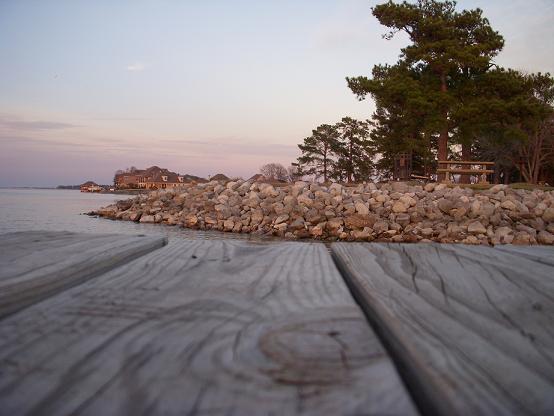
| I think the pier boards take too much space in the image. |
|
|
|
03/11/2008 03:12:57 AM |
a bit washed out for me
I cant see much of a tilt but least you had a go |
|
|
|
03/10/2008 09:43:47 AM |
| Nice color contrast between the trees and the beach/rocks. Good patterns in the wood. would be nice to see more water in the pic though. |
|
|
|
03/09/2008 06:36:27 PM |
| This doesn't really meet the objective as this is a straight on shot, and its supposed to be tilted. |
|
|
|
03/08/2008 11:24:28 PM |
| Nice capture, but DNMC for me. |
|
|
|
03/08/2008 05:20:05 PM |
| For me this doesn't have much to grab my attention |
|
|
|
03/07/2008 03:53:31 PM |
|
|
|
03/07/2008 10:25:19 AM |
| Nice picture and use of negative space... not tilted at all though... |
|
|
|
03/06/2008 09:35:01 AM |
| Nice photograph, but this does not fit the contest. This isn't tlited. |
|
|
|
03/05/2008 07:48:32 PM |
| There is really no tilt here in the spirit of the challenge.. The photo needs more "punch", for example, the "blah" sky. |
|
|
|
03/05/2008 11:04:19 AM |
|
Home -
Challenges -
Community -
League -
Photos -
Cameras -
Lenses -
Learn -
Help -
Terms of Use -
Privacy -
Top ^
DPChallenge, and website content and design, Copyright © 2001-2026 Challenging Technologies, LLC.
All digital photo copyrights belong to the photographers and may not be used without permission.
Current Server Time: 02/01/2026 07:31:07 AM EST.