| Author | Thread |
Comments Made During the Challenge  |
|
|
03/03/2008 08:15:33 AM |
| Hmmm. Was this a single capture??? If so, very well done. If not, oh well... Not cool. |
|
 Photographer found comment helpful. Photographer found comment helpful. |
|
|
03/03/2008 07:08:27 AM |
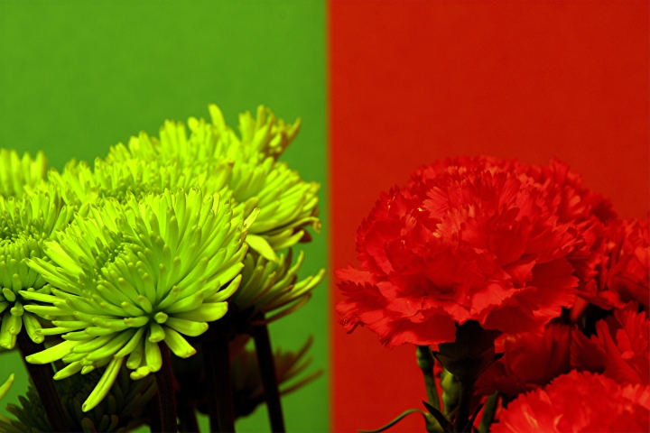
| Interesting, I like the differences in color, and the differences in the flowers. |
|
| Photographer found comment helpful. |
|
|
03/03/2008 05:14:46 AM |
| what happened to only being allowed to use 1 image. |
|
| Photographer found comment helpful. |
|
|
03/01/2008 07:01:52 AM |
|
|
|
03/01/2008 02:21:35 AM |
| eather 1 would have been better to me. |
|
| Photographer found comment helpful. |
|
|
02/29/2008 04:52:20 AM |
| By using both colors, you distract from the photograph. Its hard to determine which to look at, it would have been better if you had chosen only one color. |
|
| Photographer found comment helpful. |
|
|
02/28/2008 04:37:42 AM |
| The picture on the left isn't as strong to me. I think you would have been better off only submiting the picture on the right. The left image looks unnatural and doesnt really look as good because the greens are so different, the one on the right has better compostion and is more focused. |
|
| Photographer found comment helpful. |
|
|
02/28/2008 03:24:35 AM |
| I think a decision here would have made a much better shot. Both ideas were great, but together, IMO, does not make an asthetically pleasing shot. Hope this helps. |
|
| Photographer found comment helpful. |
|
|
02/27/2008 01:42:29 PM |
|
|
|
02/27/2008 10:15:04 AM |
| I like the two colors together and how the flowers match the background well. |
|
| Photographer found comment helpful. |
|
|
02/27/2008 09:04:43 AM |
I do like these colours together but I don't think either picture is well enough composed to stand on its own.
Both the flowers are slightly pointing away from each other which separates the pictures and there's a little to much headroom for my taste.
Good detail and depth of field and I think the left colour is really refreshing, I'd have liked to seen more yellow in the background to match. |
|
| Photographer found comment helpful. |
|
|
02/27/2008 06:01:49 AM |
|
|
|
02/27/2008 05:14:54 AM |
| Cool. two-for-one special offer. |
|
|
|
02/27/2008 04:37:43 AM |
| A very cool idea, and when you separate the 2 they are each great shots. |
|
| Photographer found comment helpful. |
|
|
02/27/2008 03:17:49 AM |
Is it really one image?
Well done |
|
| Photographer found comment helpful. |
Home -
Challenges -
Community -
League -
Photos -
Cameras -
Lenses -
Learn -
Help -
Terms of Use -
Privacy -
Top ^
DPChallenge, and website content and design, Copyright © 2001-2025 Challenging Technologies, LLC.
All digital photo copyrights belong to the photographers and may not be used without permission.
Current Server Time: 04/07/2025 01:57:00 PM EDT.