| Author | Thread |
Comments Made During the Challenge  |
|
|
03/04/2008 05:16:35 PM |
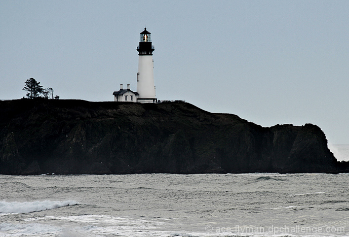
| I really like Light Houses, and this one doesn't disappoint. I only wish the composition was a bit different, showing more sea to the right, with the light house farther left, and maybe down some. Just a bit too close to center for my tastes. |
|
 Photographer found comment helpful. Photographer found comment helpful. |
|
|
03/02/2008 07:37:07 PM |
|
| Photographer found comment helpful. |
|
|
02/28/2008 01:27:11 PM |
|
|
|
02/28/2008 09:21:17 AM |
| Maybe you should change the composition so that the lighthouse is on the left edge, leaving the head and showing the more of the wintery gray water. BTW, I used to live on this point and no this lighthouse well. |
|
| Photographer found comment helpful. |
|
|
02/27/2008 09:04:28 AM |
|
| Photographer found comment helpful. |
|
|
02/27/2008 01:49:34 AM |
| Great use of black and white. I think I'd like the lighthouse a little more off center... maybe in the upper left hand corner to simplify and also see the end of the land on the right. |
|
| Photographer found comment helpful. |
Home -
Challenges -
Community -
League -
Photos -
Cameras -
Lenses -
Learn -
Help -
Terms of Use -
Privacy -
Top ^
DPChallenge, and website content and design, Copyright © 2001-2025 Challenging Technologies, LLC.
All digital photo copyrights belong to the photographers and may not be used without permission.
Current Server Time: 04/07/2025 02:08:16 AM EDT.