| Author | Thread |
Comments Made During the Challenge  |
|
|
03/22/2004 11:05:58 PM |
|
 Photographer found comment helpful. Photographer found comment helpful. |
|
|
03/22/2004 06:32:20 AM |
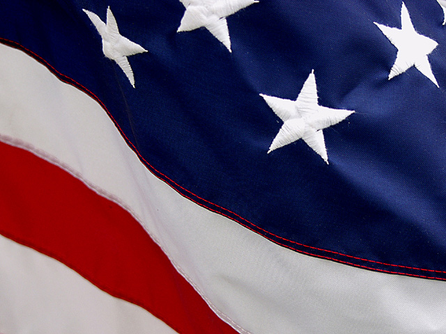
| Always one fo my favorites. Well done. My eyes are drawn to the red stitched parallel lines on the blue field. Nice composition and colors. |
|
| Photographer found comment helpful. |
|
|
03/21/2004 06:56:23 AM |
| nothing against america, but PLEASE this is too corny!!! besides where are the parallels? |
|
|
|
03/18/2004 11:04:22 AM |
| Concentrating on just a small segment of the flag makes this shot more unusual than many stars and stripes images around. I like the composition too with the slightly S shaped curve from blue to white. Lighting seems a little mixed - too shaded in lower area and bright enough on the stars to wash out teh detail of the threads. But nice overall with great cropping. |
|
| Photographer found comment helpful. |
|
|
03/18/2004 11:02:20 AM |
| NIce image, like the light in the top right portion of the image |
|
| Photographer found comment helpful. |
|
|
03/18/2004 02:03:38 AM |
|
|
|
03/17/2004 08:48:24 AM |
| Amen. Nice interpretation. |
|
| Photographer found comment helpful. |
|
|
03/17/2004 06:06:24 AM |
|
|
|
03/17/2004 05:09:04 AM |
| I look at this image and I dont immediately think of parallel lines. The lines as shown in this image aren't parallel looking at all. They're wavy looking (even if I know they are parallel on the flag itself) While I dont think this is very original at all I'm not going to give you a low score based on that or the message it conveys. I've seen an american flag before and the colours are bright and vibrant. The colours in this image look subdued and flat. Better lighting and a different arrangement of the lines in this picture would have yielded a higher score from me. |
|
| Photographer found comment helpful. |
|
|
03/17/2004 03:42:51 AM |
| For this challenge: More stripes, less stars |
|
| Photographer found comment helpful. |
Home -
Challenges -
Community -
League -
Photos -
Cameras -
Lenses -
Learn -
Help -
Terms of Use -
Privacy -
Top ^
DPChallenge, and website content and design, Copyright © 2001-2025 Challenging Technologies, LLC.
All digital photo copyrights belong to the photographers and may not be used without permission.
Current Server Time: 04/07/2025 02:21:53 PM EDT.