| Author | Thread |
Comments Made During the Challenge  |
|
|
03/23/2004 10:19:32 PM |
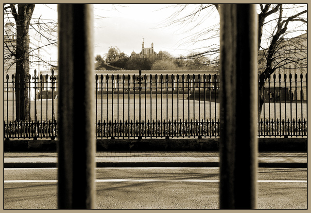
| Great toning. Wonderful natural framing of the structure in the background, but also great use of layers with the columns/poles, fence, and then structure. Lots of parallel lines going on here! Nicely seen and captured. |
|
 Photographer found comment helpful. Photographer found comment helpful. |
|
|
03/23/2004 03:39:24 PM |
| You have met the challenge. I do think you could of cropped this tighter to give it some drama. |
|
| Photographer found comment helpful. |
|
|
03/23/2004 04:03:32 AM |
| The blurry pillars in the foreground distract from the picture for me, especially |
|
| Photographer found comment helpful. |
|
|
03/22/2004 07:04:10 PM |
| I like the two parallels on this side of the road, which counterpoint the railings across the road. The building in the distanace looks a bit like the Royal Observatory at Greenwich, am I right. This is nice. |
|
| Photographer found comment helpful. |
|
|
03/20/2004 10:36:00 PM |
| Cool photo......I really think the fence and the awesome background would have been sufficiant though. The poles are a bit too much...nice photo none the less..good luck. |
|
| Photographer found comment helpful. |
|
|
03/19/2004 05:28:25 PM |
| Nice title. Love the picture too. Actually one of the better pics in this challnge if you ask me. |
|
| Photographer found comment helpful. |
|
|
03/18/2004 06:58:31 PM |
| I'm a little disconcerted by the out of focus foreground in the this one, I do like the composition though... just wish more were in focus! :) |
|
| Photographer found comment helpful. |
|
|
03/18/2004 05:45:32 PM |
| The tone REALLY give this a dramatic feel. I love how the pillars frame the photo. The lines are what this is all about. MAJOR impact you've created ! This is truly a GREAT photo ! |
|
| Photographer found comment helpful. |
|
|
03/18/2004 03:50:17 PM |
This is a very good photograph for this challenge because there are so many interesting parallel lines. I love the way the two closeup bars frame the building in the far distance, and also how they are mirrored by the trees (a shame that the tree on the right is cut off a bit, would have been better if the entiree tree as visible). Sepia is well suited for this photograph as it lends an old time feeling to the scene, and also saved what looks like a washed out sky.
Other than the tree being cut in half, the only other impovement that I would suggest is maybe more DOF so that the close bars are more in focus, although being a little soft does not bother me too much. |
|
| Photographer found comment helpful. |
|
|
03/18/2004 09:45:37 AM |
| Great capture, where ever I look there are parallel lines. Superb symmetry and letting the sky burn out accents the railings. |
|
| Photographer found comment helpful. |
|
|
03/18/2004 05:23:38 AM |
| This one looks familiar.. The foreground bars definitely give this shot impact, and the DoF is nice. Pity the clouds above the observatory come out as flat, but we couldn't control the weather ;o) Why call it '.' though? |
|
| Photographer found comment helpful. |
|
|
03/17/2004 07:30:46 PM |
|
| Photographer found comment helpful. |
|
|
03/17/2004 06:31:50 PM |
| You are usually otld not to use vertical lines in composing, but the symmetry makes it work. |
|
| Photographer found comment helpful. |
|
|
03/17/2004 05:49:39 PM |
| I really like this shot. The 2 main paralell lines separate the image into 3 nice parts with the 2 edge ones being very similar. The repetition of them further away across the other side of the road works really well as it puts them into context. I think it looks slightly off balance tho, the right section being a bit smaller than the left. It might be the same size but it looks different, probably because of the tree. I think the sepia tone works well, along with the border. |
|
| Photographer found comment helpful. |
|
|
03/17/2004 05:21:39 PM |
| I like looking through the out of focus, close up frame, and it certainly meets the challenge. Often I see shots like this and feel it is a stage, just waiting on the subject to arrive - this feels somewhat like that too - a person, some detail that would lift this scene to a more visually interesting level. The scene is well set... |
|
| Photographer found comment helpful. |
|
|
03/17/2004 03:02:06 PM |
| This is very interesting. I like the sepia-kind of quality to it. 10 |
|
| Photographer found comment helpful. |
|
|
03/17/2004 12:07:21 PM |
| I absolutely love the tones, the layers and the lighting. Great composition. I'm giving it a 10. |
|
| Photographer found comment helpful. |
|
|
03/17/2004 12:06:19 AM |
Great point of view. Beautiful tone and focus. It shows a lot of lines. Nice border, a black one would look good too...I give it a 10
Good luck... |
|
| Photographer found comment helpful. |
Home -
Challenges -
Community -
League -
Photos -
Cameras -
Lenses -
Learn -
Help -
Terms of Use -
Privacy -
Top ^
DPChallenge, and website content and design, Copyright © 2001-2026 Challenging Technologies, LLC.
All digital photo copyrights belong to the photographers and may not be used without permission.
Current Server Time: 02/01/2026 08:29:42 AM EST.