| Author | Thread |
Comments Made During the Challenge  |
|
|
02/19/2008 11:56:34 PM |
| Not quite sharp in the fine details. If this was handheld, a tripod may have been in order. |
|
 Photographer found comment helpful. Photographer found comment helpful. |
|
|
02/19/2008 09:52:18 PM |
|
| Photographer found comment helpful. |
|
|
02/18/2008 09:28:55 PM |
| I think it would have like this better if the light was just a little bit softer. |
|
| Photographer found comment helpful. |
|
|
02/15/2008 07:08:40 PM |
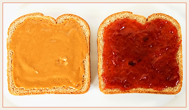
| This isn't the way one normally sees a pb&j, and that's what makes it good. The symmetric composition is cool. If you got rid of the shadows and crumbs, this would be right at home next to Worhol's soup cans. |
|
| Photographer found comment helpful. |
|
|
02/14/2008 11:14:23 AM |
| nice take on the challenge, the colours are vivid, it is all crisp and very clean to look at, well done |
|
| Photographer found comment helpful. |
|
|
02/14/2008 03:10:29 AM |
| i really like this idea. it's simple. :) |
|
| Photographer found comment helpful. |
|
|
02/13/2008 04:10:14 PM |
| A bit too bright/harsh lighting but a cute setup. |
|
| Photographer found comment helpful. |
|
|
02/13/2008 02:15:05 PM |
| This remember me the cover of the Jefferson Airplane's LP "Volunteers". 7 |
|
| Photographer found comment helpful. |
|
|
02/13/2008 11:30:19 AM |
| Over-sharp, over-saturated, possibly over-sharpened. I think some American people like the goop that's concealing the bread, but it looks pretty ghastly to me. Nice job of getting the subject isolated from the neautral background. |
|
| Photographer found comment helpful. |
Home -
Challenges -
Community -
League -
Photos -
Cameras -
Lenses -
Learn -
Help -
Terms of Use -
Privacy -
Top ^
DPChallenge, and website content and design, Copyright © 2001-2026 Challenging Technologies, LLC.
All digital photo copyrights belong to the photographers and may not be used without permission.
Current Server Time: 02/01/2026 09:04:38 AM EST.