| Author | Thread |
|
|
02/12/2008 11:55:44 PM |
| My favorite from this challenge, espcially since it is both an ad for the marker and an alternative take on the challenge through the text. I nominated it for an OOBIE award. |
|
Comments Made During the Challenge  |
|
|
02/12/2008 02:29:28 PM |
| Really good. Well composed and heck,... your gonna get lots of other great comments on this, so I'm gonna skip the analysis of this one and press on. |
|
|
|
02/12/2008 12:55:42 PM |
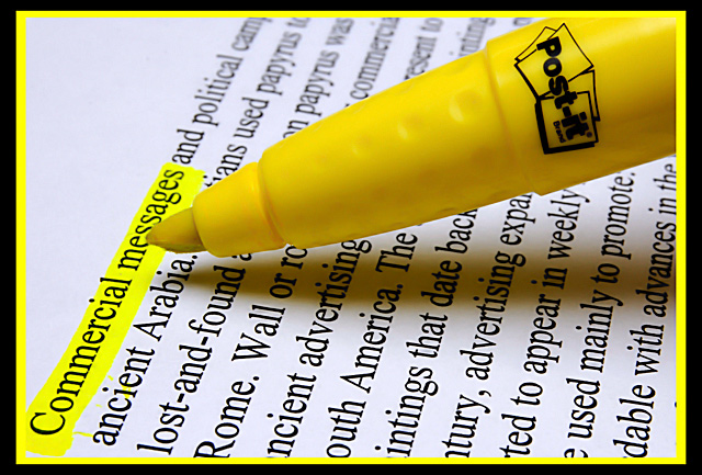
| Simple and straightforward take on the theme, and the "highlighted" frame makes sense and is actually kind of witty! |
|
|
|
02/12/2008 06:13:14 AM |
| Subtle, great positioning of the logo on the pen. It's not immediately obvious whats being advertised, but I think it works well in this case. |
|
|
|
02/11/2008 07:25:22 PM |
| Good. Bright and to the point. 7 |
|
|
|
02/11/2008 09:38:02 AM |
Very different from all the other entries. Most people have gone for a 'sexier' product, but this shot is such a high standard that it carries the product.
Delightfully crisp and clear. Technically great.
I hope it does well. |
|
|
|
02/11/2008 05:10:22 AM |
| I like the way you highlighted commercial messages by doing this it creates interest |
|
 Photographer found comment helpful. Photographer found comment helpful. |
|
|
02/10/2008 09:46:10 PM |
|
|
|
02/09/2008 08:40:41 PM |
| Nice color. Like the DOF and sharpness of on the highlighter. |
|
| Photographer found comment helpful. |
|
|
02/07/2008 02:58:47 PM |
| clear and sharp. dont like the border. 6. |
|
| Photographer found comment helpful. |
|
|
02/07/2008 11:32:14 AM |
|
| Photographer found comment helpful. |
|
|
02/06/2008 02:55:21 PM |
| Not bad. I'm sure what's being sold here but I'd find a bit more clever text to highlight. technicals are right on. |
|
| Photographer found comment helpful. |
|
|
02/06/2008 01:26:43 PM |
| That yellow border wouldn't work for anything else other than highlighters. |
|
| Photographer found comment helpful. |
|
|
02/06/2008 11:37:11 AM |
| Effective. I just don't like the shadowing on the pen. Which is a minor point. |
|
| Photographer found comment helpful. |
|
|
02/06/2008 11:29:30 AM |
| wow great sharpness and color on the highlighted and text. 8 |
|
| Photographer found comment helpful. |
|
|
02/06/2008 10:55:07 AM |
I like your take on the challenge. Great execution too (apart from the minor yellow spill on 'ancient'). I think it should ribbon, but I don't think it will, because too many voters will think this is not an advert.
Hope I am wrong though. 9 |
|
| Photographer found comment helpful. |
|
|
02/06/2008 05:58:55 AM |
|
| Photographer found comment helpful. |
|
|
02/05/2008 11:50:27 PM |
| good idea and composition. the yellow border is a bit too much and distracts from the clean and simple image |
|
| Photographer found comment helpful. |
Home -
Challenges -
Community -
League -
Photos -
Cameras -
Lenses -
Learn -
Help -
Terms of Use -
Privacy -
Top ^
DPChallenge, and website content and design, Copyright © 2001-2025 Challenging Technologies, LLC.
All digital photo copyrights belong to the photographers and may not be used without permission.
Current Server Time: 04/07/2025 01:22:29 AM EDT.