| Author | Thread |
Comments Made During the Challenge  |
|
|
02/12/2008 03:45:29 PM |
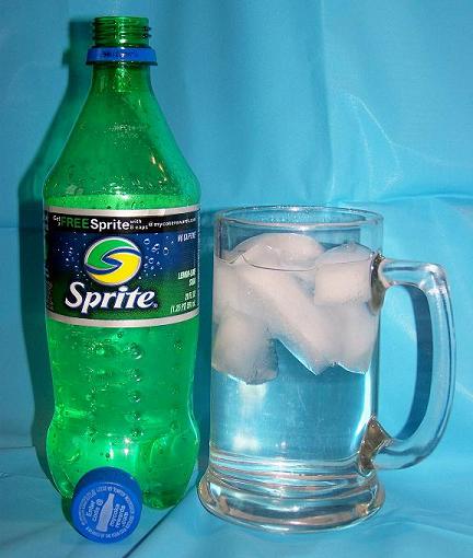
| Good idea to include the filled glass with ice to look more appealing. I would suggest a few changes - move the glass and bottle farther from the background, smooth out the background wrinkles, use a less shiny background if you have one, and put a light on the other side to reduce or eliminate the shadows. |
|
 Photographer found comment helpful. Photographer found comment helpful. |
|
|
02/11/2008 05:13:50 PM |
| I like the refraction artifacts from the mug. The lighting seems a little harsh. Maybe another light source would help. |
|
| Photographer found comment helpful. |
|
|
02/11/2008 04:45:11 PM |
| Nice product presentation and the comp works for text placement. If you move the product further away from the backdrop, you'll see less of the distracting texture of it. Also shake the soda up a bit or dip a straw in it to ge the bubble effect. I'll make the ad more appealing. |
|
| Photographer found comment helpful. |
|
|
02/11/2008 02:01:31 PM |
Advertising photography is all about details. You've done a nice job or setting up the shot but there are just a few things that would have made your shot better.
You want to bring the viewers into your scene - make them imagine themselves "using" your product so putting the sprite in a scene (on a picnic table on a sunny lawn for instance) instead of a still life would help.
One thing that makes soda pop different is that it's carbonated so bubbles are always good as is frost on the glass - make me thirsty!
Lastly, I avoid using the built in flash as much as I can (except for fill). Because there are very few shadows the images tend to look "flat".
Sorry for such a long comment but you're on the right track and I hope you'll play with this image (re-shoot it) and see what you can do.
Good Luck! |
|
| Photographer found comment helpful. |
|
|
02/11/2008 10:01:35 AM |
Good idea to use a well known product that has a dstinctive colour to help add visual impact. The shot is rather let down by the technicals though.
Pricipally the lighting is a little harsh causing the sort of shadows that you just don't see in adverts - this might have been reduced if you had used a darker (matt) background. On the subject of backgrounds, although you may not have noticed how creased the backdrop was in this shot, cameras do tend to pick out these straiht lines very clearly, so it is well worth ironing the backdrop or using a simply bit of coloured card as a backdrop.
Finally there is the dynamic element of the shot. This is a fizzy, zingy, drink . . but you have it sitting still. Perhaps if you could have had it being poured into a simpler glass or tumbler, so that you injected a bit of movement and who knows maybe even a splash or two as it hits the side of the glass.
I hope this is of some help. Good luck in the challenge . |
|
| Photographer found comment helpful. |
|
|
02/11/2008 05:23:51 AM |
| The straight on angle makes your photo boring |
|
|
|
02/10/2008 09:34:56 PM |
|
|
|
02/10/2008 03:03:53 PM |
| DOn't like the backdrop, color doesn't work for me and really don't like all the wrinkles and creases. |
|
|
|
02/10/2008 05:53:46 AM |
|
|
|
02/10/2008 03:23:24 AM |
| sorry, background needs to be smooth ... all the crinkles are too distracting |
|
|
|
02/08/2008 05:51:54 AM |
| It would look better without the shadow and a better crease free backdrop. |
|
| Photographer found comment helpful. |
|
|
02/08/2008 05:09:22 AM |
| i think you could have chosen a better background, but other than that good idea and picture. |
|
| Photographer found comment helpful. |
|
|
02/08/2008 04:53:22 AM |
| A little unglamorous. Uninteresting and a bad light source. |
|
|
|
02/07/2008 05:07:41 AM |
| The blue background does not compliment the product. Perhaps a different color background and place the product further away... or decrease the DOF, so the creases are not so sharply seen in the blue material. The drink does not have the freshly-poured look of Sprite with carbonation bubbles... Just suggestions for making this a better 'advertisement'. And only my opinion, of course. |
|
| Photographer found comment helpful. |
|
|
02/07/2008 03:17:11 AM |
| The idea is nice, but the harsh lighting causes ugly shadows. On top of that, your backdrop needs ironing. 3 |
|
| Photographer found comment helpful. |
|
|
02/06/2008 03:24:34 PM |
| I dont like the lighting here. Don't use your flash for still life. |
|
|
|
02/06/2008 05:10:55 AM |
| This shot needs something more. The cap isn't needed. |
|
|
|
02/06/2008 04:05:19 AM |
| You have a shadow behind that Sprite... another light from behind would have avoided that and make the Sprite pop. Voting 5 |
|
Home -
Challenges -
Community -
League -
Photos -
Cameras -
Lenses -
Learn -
Help -
Terms of Use -
Privacy -
Top ^
DPChallenge, and website content and design, Copyright © 2001-2025 Challenging Technologies, LLC.
All digital photo copyrights belong to the photographers and may not be used without permission.
Current Server Time: 04/07/2025 02:26:27 PM EDT.