| Author | Thread |
Comments Made During the Challenge  |
|
|
02/11/2008 12:12:48 PM |
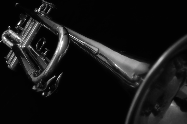
| The subject is almost the same color as the background, which makes it hard to differ the two. By using a brighter background it would make the subject pop. |
|
|
|
02/11/2008 09:57:20 AM |
| Very nice photo. It could stand to be a bit brighter and I'm not sure that the b/w is good for this shot. |
|
|
|
02/11/2008 09:38:17 AM |
| I like the angle of this photograph but it's hard to tell where the focus is directed. It has a good range of values. |
|
|
|
02/11/2008 02:38:49 AM |
| pretty good but it doesnt jump out at the viewer |
|
|
|
02/10/2008 07:07:01 PM |
| Nice artistic shot that would probably work better on a jazz concert poster than a trumpet sale. Nice negative space for text. Nice work. |
|
 Photographer found comment helpful. Photographer found comment helpful. |
|
|
02/10/2008 06:45:25 PM |
| The focal point seems a little weird to me. Think it would be better a little further forward. Also a little dark for my taste |
|
|
|
02/08/2008 09:59:05 AM |
| The Hear part is really stupid |
|
|
|
02/06/2008 10:27:54 PM |
| What are you advertising?? |
|
|
|
02/06/2008 04:18:06 PM |
| Nice photo. I would have liked to see more of the horn. |
|
|
|
02/06/2008 03:10:13 PM |
| this is cool. you can see the reflections although they are distorted. |
|
|
|
02/06/2008 09:23:14 AM |
| could have more highlights around the bell |
|
|
|
02/06/2008 09:17:37 AM |
| crop too tight at left and up for me. Angle is great. Voting 6. |
|
Home -
Challenges -
Community -
League -
Photos -
Cameras -
Lenses -
Learn -
Help -
Terms of Use -
Privacy -
Top ^
DPChallenge, and website content and design, Copyright © 2001-2026 Challenging Technologies, LLC.
All digital photo copyrights belong to the photographers and may not be used without permission.
Current Server Time: 02/01/2026 10:52:48 AM EST.