| Author | Thread |
Comments Made During the Challenge  |
|
|
02/12/2008 01:17:18 PM |
| Simple and effective. Good work. |
|
 Photographer found comment helpful. Photographer found comment helpful. |
|
|
02/11/2008 05:21:36 PM |
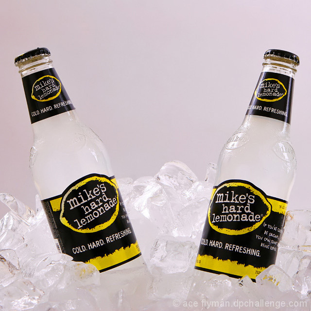
| Great work. Ice gives the ad a "cold" feel to it. Product is well presented and the photo is perfectly sharp. Tones add to the visual fell and the comp is excellent for text placement in the future. I really like the symmetrical aspect of this too. 10 |
|
| Photographer found comment helpful. |
|
|
02/11/2008 10:26:02 AM |
A nice idea - the only issue is that with the bottles both pointing out towards the top corners the visual centre of the picture actually has nothing in it . .
Maybe if you had perched a Lemon on top of the ice right in the middle it would have picked up both on the colour of the lables visually, and the theme of lemonade ? I would also ideally have liked to see the background whiter. On my screen this backdrop is just not crisp and white.
good luck in the challenge. |
|
| Photographer found comment helpful. |
|
|
02/10/2008 09:30:18 PM |
|
| Photographer found comment helpful. |
|
|
02/07/2008 03:47:38 PM |
| Mist with water next time?!? |
|
| Photographer found comment helpful. |
|
|
02/07/2008 04:22:51 AM |
|
| Photographer found comment helpful. |
|
|
02/06/2008 10:18:09 AM |
|
| Photographer found comment helpful. |
|
|
02/06/2008 09:53:11 AM |
| this could def be an ad, but i think one bottle would suffice. |
|
| Photographer found comment helpful. |
|
|
02/06/2008 05:54:19 AM |
| This idea is a little old fashioned for a modern advert. A different angle on the subject would give it more impact. |
|
| Photographer found comment helpful. |
Home -
Challenges -
Community -
League -
Photos -
Cameras -
Lenses -
Learn -
Help -
Terms of Use -
Privacy -
Top ^
DPChallenge, and website content and design, Copyright © 2001-2025 Challenging Technologies, LLC.
All digital photo copyrights belong to the photographers and may not be used without permission.
Current Server Time: 04/07/2025 04:42:31 AM EDT.