| Author | Thread |
|
|
02/29/2008 12:13:12 AM |
| I like the way that you've used textures to give this an aged photo feel without making it too obvious. |
|
 Photographer found comment helpful. Photographer found comment helpful. |
|
|
02/09/2008 01:00:25 AM |
| Outstanding! Yer still a fav! :) |
|
| Photographer found comment helpful. |
|
|
02/04/2008 03:03:14 PM |
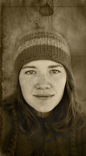
| You look a lot like my daughter's best friend! This is a great picture. the combination of wool hat & sepia makes it looks from the 30-40s. Great job! |
|
| Photographer found comment helpful. |
|
|
02/03/2008 03:47:45 PM |
| fantastic! i love the tones and your hair and freckles go great with them. awesome shot. |
|
| Photographer found comment helpful. |
|
|
02/03/2008 09:32:36 AM |
lovely editing, it gives a feeling of one of those pictures you find in your grandmothers drawers after she's passed and stare at the picture and go, "wonder who this was and what her story was"
Great job today Leisha. |
|
| Photographer found comment helpful. |
|
|
02/03/2008 08:28:29 AM |
| I like this one, the sepia gives a nice affect here with the balance of contrasts very smooth. Nice job. |
|
| Photographer found comment helpful. |
|
|
02/03/2008 06:51:21 AM |
| Very nice. Your face comes out of the dark in this very beautifully. I really like the straight-on composition. It has a lovely natural feel. The spot above your head adds a sense of mystery for me... something like you might have seen in a medieval iconic panel painting indicating divinity... and the rough texture hints at a painting on some natural surface. The numbers add a sense of formality in an otherwise very natural-looking surface. This is great, with many layers when you look at it, very nice. |
|
| Photographer found comment helpful. |
|
|
02/03/2008 06:37:58 AM |
| I love your freckles and I think the processing helped to bring them out. |
|
| Photographer found comment helpful. |
|
|
02/03/2008 05:47:55 AM |
| Love the eyes and the subtle smile. Beautiful processing everywhere except the top of the hat ... it almost merges with the wall. Need to do something about that ... maybe burn the wall? |
|
| Photographer found comment helpful. |
|
|
02/03/2008 05:37:51 AM |
| Nice sepia. It is just a little too straight to give it the character that it needs. |
|
| Photographer found comment helpful. |
|
|
02/03/2008 05:24:20 AM |
| This one (I feel) is just a little bit too "straight"... you know what I mean? I don't know how to explain it... I love the tones and the overlay and as usual, your eyes look GREAT! :) |
|
| Photographer found comment helpful. |
Home -
Challenges -
Community -
League -
Photos -
Cameras -
Lenses -
Learn -
Help -
Terms of Use -
Privacy -
Top ^
DPChallenge, and website content and design, Copyright © 2001-2025 Challenging Technologies, LLC.
All digital photo copyrights belong to the photographers and may not be used without permission.
Current Server Time: 04/18/2025 01:07:41 PM EDT.