| Author | Thread |
|
|
03/01/2008 06:39:56 AM |
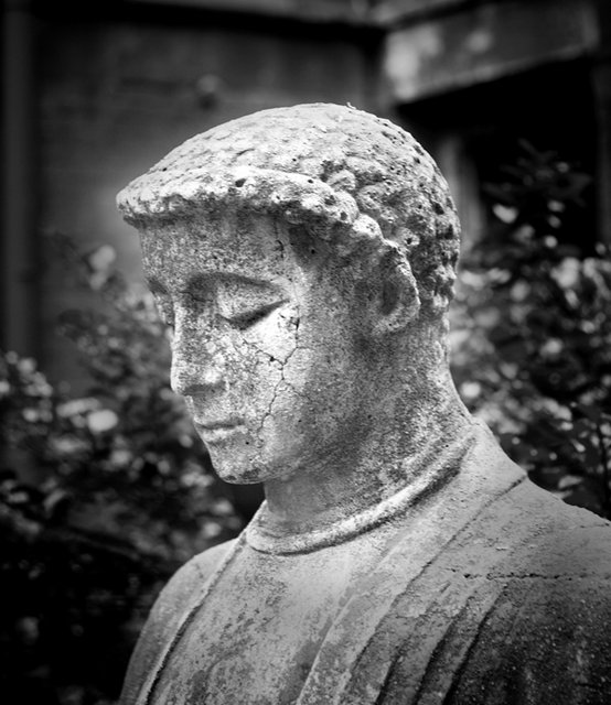
| The conversion here helps, I think. I'm not a big fan of statues out of context (as the primary focus of the shot). The tones and textures work well, except for that bit around the head. |
|
 Photographer found comment helpful. Photographer found comment helpful. |
|
|
02/11/2008 11:42:42 PM |
| I've spent some time looking at this and the original. The bw conversion is good on most of the statue (I did like the moss though), but your haloing puzzles me because the head is already well defined in the original; as well there is I think a suitably muted feel in the original. (Possibly icons from the east are not in need of halo?) |
|
| Photographer found comment helpful. |
|
|
02/05/2008 08:15:08 PM |
| Nice pic, i like the texutes captured. I do feel the vignette is a bit strong, though I'm sure you were trying to calm down the busy background with it. |
|
| Photographer found comment helpful. |
|
|
02/05/2008 10:20:16 AM |
| Good DOF, and I like the textures. I'm not crazy about the vignetting...makes it look like the center of the photo was dodged. |
|
| Photographer found comment helpful. |
|
|
02/05/2008 08:24:24 AM |
| I like the saintly glow around it. One thing I would have tried in addition to this is to burn some of the textures to create more of a contrast within the statue. But that's just me, contrast queen :) |
|
| Photographer found comment helpful. |
|
|
02/05/2008 05:46:03 AM |
| not over processed at all. I really like the texture and detail on his face. The background is a bit distracting but I do like the vignetting used. |
|
| Photographer found comment helpful. |
|
|
02/03/2008 07:28:55 PM |
| I don't think it's over processed. It suits the subject perfectly. Well done! |
|
| Photographer found comment helpful. |
|
|
02/03/2008 05:44:28 PM |
| interesting statue and face. The image seems to contrasty for me. I want to see the fine detail in this one. |
|
| Photographer found comment helpful. |
|
|
02/03/2008 05:41:11 PM |
| I think Peter nailed my thoughts before I typed them. The effect is there, but it doesn't quite have that natural look, and a more subtle transition may have worked better. However, the B&W is strong and you've made a simple statue interesting to look at. |
|
| Photographer found comment helpful. |
|
|
02/03/2008 11:43:41 AM |
| Visual metaphor and allusions are important tools in a photographer's kit, so you remind me. The cracks, tranquility, and bowed head, have symbolic meaning to me. |
|
| Photographer found comment helpful. |
|
|
02/03/2008 11:22:33 AM |
| the crop and the background work well together - i like the contemplative face of the statue - i am not a fan of the heavyhanded touch with the burn and dodge - i can see where you are trying to go - illuminate the statue so it glows or radiates - but i wonder if the transitions between the burn and dodge are too severe |
|
| Photographer found comment helpful. |
|
|
02/03/2008 11:06:01 AM |
| ok, maybe a little over processed and there is a bit of a holo around his face, otherwise a nice example. Not normally a fan of a central pic but it seems to work well here. |
|
| Photographer found comment helpful. |
|
|
02/03/2008 06:44:04 AM |
| You did a good job separating the foreground from the background with your processing. |
|
| Photographer found comment helpful. |
|
|
02/03/2008 05:22:53 AM |
| I like the subject, it lends itself well to b&w. However, I do think you may have dodged a little bit too much around the head as there is a slight halo effect. |
|
| Photographer found comment helpful. |
|
|
02/03/2008 03:32:48 AM |
| The texture of the statue was brought out nicely, and I like the radiance of the face, but I would have preferred no radiance in the background right around the head. |
|
| Photographer found comment helpful. |
|
|
02/03/2008 03:20:31 AM |
| I think your post processing suits the photograph just fine. There's a bit of a radiance to the face, and it shows off the texture of the statue well. |
|
| Photographer found comment helpful. |
|
|
02/02/2008 06:49:35 PM |
| Nice capture. The texture is great. I personally like the vignette. |
|
| Photographer found comment helpful. |
|
|
02/02/2008 02:50:31 PM |
|
| Photographer found comment helpful. |
|
|
02/02/2008 01:56:48 PM |
yeah a little over-processed, i dont like the vignette in this situation, it makes him look like hes glowing or something, i was never a fan of that style.
nice capture though, maybe less headroom? mmaybe this is just not my style |
|
| Photographer found comment helpful. |
Home -
Challenges -
Community -
League -
Photos -
Cameras -
Lenses -
Learn -
Help -
Terms of Use -
Privacy -
Top ^
DPChallenge, and website content and design, Copyright © 2001-2025 Challenging Technologies, LLC.
All digital photo copyrights belong to the photographers and may not be used without permission.
Current Server Time: 04/07/2025 04:58:16 AM EDT.