| Author | Thread |
Comments Made During the Challenge  |
|
|
02/11/2008 10:29:57 AM |
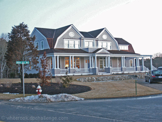
| The photo is not sharp and there is too much negative space |
|
|
|
02/11/2008 02:30:57 AM |
|
 Photographer found comment helpful. Photographer found comment helpful. |
|
|
02/10/2008 09:51:19 PM |
| I don't how this is going for you but I made quite a bit of money shooting houses just like this for real estate agents. I'd use a tripod to sharpen it up a bit and perhaps wait for better light. |
|
| Photographer found comment helpful. |
|
|
02/10/2008 10:03:54 AM |
| Car crop. That rod in the ground. Snow is snow. |
|
|
|
02/10/2008 02:03:12 AM |
| It's ok but doesn't really grab me. My eyes were initially drawn to the blurry street sign, then to the house. |
|
|
|
02/10/2008 12:05:54 AM |
|
|
|
02/09/2008 11:17:36 PM |
| The focus is not that sharp, and there is no for sale sign to even tell a viewer that the property is available. |
|
|
|
02/07/2008 08:09:49 AM |
| The picture is unlevel, not very sharp and the sky is severely overprocessed. Sorry to have to put it this way, but this is not the way to sell a house. 3 |
|
|
|
02/07/2008 06:18:53 AM |
|
|
|
02/06/2008 09:46:33 PM |
| Wow, looks like a painting |
|
| Photographer found comment helpful. |
|
|
02/06/2008 09:28:09 PM |
| Interesting concept, I shoot MLS listings for Trend so this entry caught my eye. Around here, that house would list for approx $750,000. But I would have eliminated the street sign and fire hydrant, a frontal view would have worked better. ;-) |
|
| Photographer found comment helpful. |
|
|
02/06/2008 04:20:01 PM |
| The horizon is a little crooked. Including the street doesn't seem necessary. I do like the way you can see the warm glow of lights through the front window. |
|
|
|
02/06/2008 04:14:45 PM |
| Looks more like a quick photograph. Would have been a better shot with the camera a bit more centered and maybe without the fire hydrant and street sign. |
|
|
|
02/06/2008 10:55:14 AM |
| This image would be greatly improved with better lighting and a more interesting angle of view. |
|
| Photographer found comment helpful. |
|
|
02/06/2008 10:08:54 AM |
| Exposure and sharp aren't that good. |
|
|
|
02/06/2008 09:26:26 AM |
|
| Photographer found comment helpful. |
|
|
02/06/2008 09:16:06 AM |
| It is a bit "grainy"... the crop is not very effective, you should (IMHO) have cropped the bottom part. 4 |
|
|
|
02/06/2008 08:09:45 AM |
| reminds me of my architectual walmart shot, too much road |
|
|
|
02/06/2008 12:50:02 AM |
| Nice house. Good colors given the weather. Well composed. I think a bit more contrast would counter the over-exposed feeling I get here, and straightening the photo would help. Just my opinion. |
|
Home -
Challenges -
Community -
League -
Photos -
Cameras -
Lenses -
Learn -
Help -
Terms of Use -
Privacy -
Top ^
DPChallenge, and website content and design, Copyright © 2001-2026 Challenging Technologies, LLC.
All digital photo copyrights belong to the photographers and may not be used without permission.
Current Server Time: 02/01/2026 07:52:07 AM EST.