| Author | Thread |
|
|
03/01/2008 06:13:17 AM |
| Standing for so long, such a heavy burden, must be hard. A wonderful conversion of the original, with tones that play much better to my eye. |
|
 Photographer found comment helpful. Photographer found comment helpful. |
|
|
02/12/2008 10:07:09 PM |
| Very powerful. The black and white, by just allowing the light (and whatever sensible things you did in converting) to tell the story, really draws it all together. Excellent example of the power of black and white - I hope I'm listening. |
|
| Photographer found comment helpful. |
|
|
02/09/2008 12:35:40 PM |
| It looks great, so many buildings in the background really make them ladies pop. well done! I think possibly a little bit of tonal difference between foreground and background image would help more. Perhaps brighten the foreground and darken the background? I dunno just a thought. |
|
| Photographer found comment helpful. |
|
|
02/05/2008 08:02:53 AM |
| Oh yeah this does look great in black and white! The statues really pop out now. I'm guessing that since the picture is bigger that the statues seem more prominent? Really nice job with the edit! |
|
| Photographer found comment helpful. |
|
|
02/03/2008 05:52:20 PM |
|
| Photographer found comment helpful. |
|
|
02/03/2008 01:49:20 PM |
| This has a classic feel to it, and something I would expect to see in a travel brochure. I find the B&W more interesting than the color. |
|
| Photographer found comment helpful. |
|
|
02/03/2008 11:51:43 AM |
| Far and near, focus and defocused are what I must learn to do better - at the same time as framing well and exposing to the optimum. Thank you for such an elegant lesson. |
|
| Photographer found comment helpful. |
|
|
02/03/2008 11:07:55 AM |
A DPC 5 second voter....
" the background is too busy - you really should blur it out - it is very distracting - and you really should add a bunch more color to the foreground - it is too blah- also, the rule of thirds are violated - what is it with this fill half the scene with the subject"
Me...
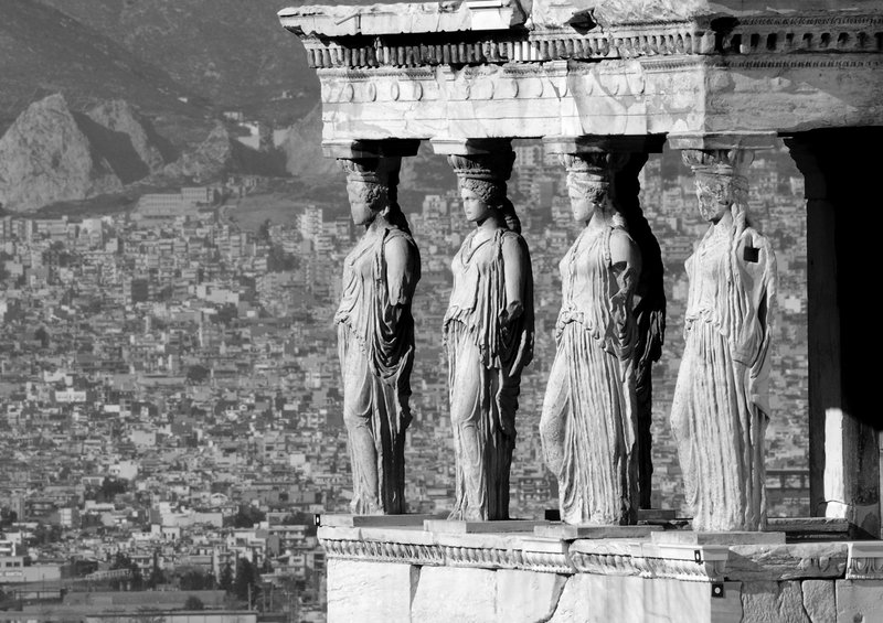
"Fabulous use of background to set the place, excellent use of split screen to show the ancient and the modern, fantastic lighting on the faces. I especially like how the lady on the far right is missing her arm - but has not neglected her duty to stand in place - very honorable? |
|
| Photographer found comment helpful. |
|
|
02/03/2008 05:12:14 AM |
| As others before have said this is definitely one that looks better in B&W. It is so crisp and clear. Well done, it's wonderful. |
|
| Photographer found comment helpful. |
|
|
02/03/2008 03:51:38 AM |
| Stunning photo, like the composition and the different degrees of focus of foreground/background. |
|
| Photographer found comment helpful. |
|
|
02/02/2008 10:10:30 AM |
I like both versions but agree its probably better auited to B&W. Am just wondering if we can see the last weeks graveyard shot from this view?
Could almost have been reshot and used for the advertising challenge 'visit Greece and explore...'
|
|
| Photographer found comment helpful. |
|
|
02/02/2008 08:22:59 AM |
| Wow, what a view they have! This is beautiful in B&W. |
|
| Photographer found comment helpful. |
|
|
02/02/2008 07:19:09 AM |
| I think the b&w version is very befitting for this image. The details become more of a focus than the statues themselves. |
|
| Photographer found comment helpful. |
|
|
02/01/2008 07:33:53 PM |
| Far OUT! This is totally brilliant - love the composition and this crazy huge city in the background with the amazingly focused statue/columns in the front. Wonderful. |
|
| Photographer found comment helpful. |
|
|
02/01/2008 07:09:54 PM |
| I really like this in b&w, what a great shot with the city in the background. Nicely done compositon! |
|
| Photographer found comment helpful. |
|
|
02/01/2008 07:51:27 AM |
| Hey Kolasi, I didn't see this in the dec free study so I'm just now seeing it. I really like this composition. The layering and layering of city in the background is so interesting visually. That pillar on the right has some serious weathering going on! It is missing it's arm and face! Very interesting composition and I love the black and white. |
|
| Photographer found comment helpful. |
|
|
02/01/2008 05:52:11 AM |
| I am so jealous! I would love to go here someday. I love all the old architecture. They were amazing back in the day. Strange how these are so amazing and yet they don't care to build like this anymore, anywhere. Sad. I love being able to see the city in the background. |
|
| Photographer found comment helpful. |
|
|
02/01/2008 05:32:17 AM |
Yes, I agree: this photo is much better suited to black and white. I think the architecture being so old looking fits better with a black and white look. . .more nostalgic, plus the contrast of the statutes seems to stand out more. This is really beautiful!
|
|
| Photographer found comment helpful. |
|
|
02/01/2008 02:07:20 AM |
I prefer this version. It has some harsh light and shadows.. but they're in some harsh conditions.
|
|
| Photographer found comment helpful. |
|
|
01/31/2008 09:52:28 PM |
| Ah yes, definitely prefer it in black and white! It may be a shot others have taken, but this one is your version and that's a neat thing to have, in my opinion. |
|
| Photographer found comment helpful. |
Home -
Challenges -
Community -
League -
Photos -
Cameras -
Lenses -
Learn -
Help -
Terms of Use -
Privacy -
Top ^
DPChallenge, and website content and design, Copyright © 2001-2025 Challenging Technologies, LLC.
All digital photo copyrights belong to the photographers and may not be used without permission.
Current Server Time: 04/07/2025 01:01:08 AM EDT.