| Author | Thread |
|
|
03/15/2008 09:28:17 AM |
Hey!
Ok, you wanted me to have a look at this (finally got around to it - it's been a busy time!)
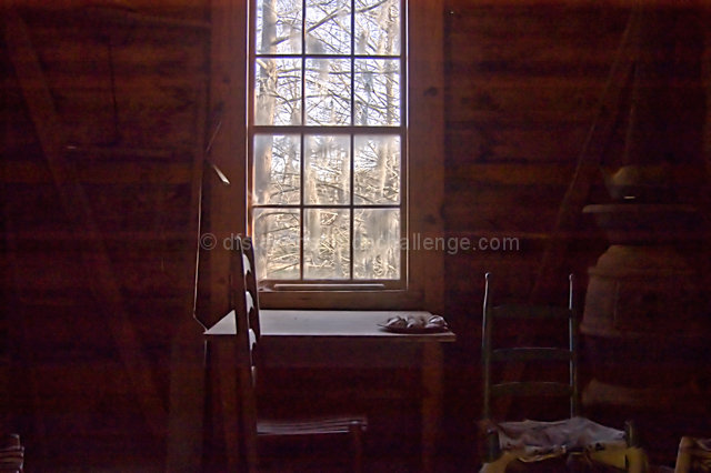
Some very interesting geometry in this shot - the interaction of horizontal and vertical lines all over the place looks pretty cool. The combination of the noise and the right chair blending into the horizontal stripes makes it look unreal, almost like an apparition rather than a real object. Old ways indeed. So I like the subject matter and the style.
The composition doesn't particularly work for me though. The centred window looks static and oddly cut off, and the directions of some of the diagonal beams make the picture feel tilted clockwise when viewed, even though it's not. I think the picture would benefit greatly from losing that empty left bit (I tried cropping it, and it works a lot better for me).
PP suggestions - since this is in basic, the options are rather limited. What I thought worked is sharpening this at about 45px, 30% usm to bring out the contrast more. I also liked the look of desating it very slightly (monochrome channel mixer layer, 100% red channel, 15% opacity), but that's more a matter of taste, I think.
Anyway, hope this helps.
Jelena
|
|
Comments Made During the Challenge  |
|
|
02/05/2008 02:17:05 PM |
| there is alot of noise and thats not to my taste. |
|
|
|
02/05/2008 11:16:53 AM |
|
 Photographer found comment helpful. Photographer found comment helpful. |
|
|
02/05/2008 04:17:57 AM |
| Such an ethereal feel to this. I don't know how you got the effect you did, it almost looks like you walked into a long abandoned place and slammed the door hard. In doing so, you worked up some dust throughout... but it is so effective. I just love it. And is that a horse outside the window? I'm telling myself yes, and loving it more. |
|
| Photographer found comment helpful. |
|
|
02/04/2008 02:14:55 AM |
| This is just calling out for some dual-exposure HDR! Nice rustic scene, but the noisy photo lets it down. |
|
| Photographer found comment helpful. |
|
|
02/03/2008 12:36:12 PM |
| Nice balance and softness. Well done. |
|
| Photographer found comment helpful. |
|
|
02/02/2008 03:36:23 PM |
| Nice idea. I'd crop the left side out to the paddle, to make the rule of thirds apply to the composition. |
|
| Photographer found comment helpful. |
|
|
02/01/2008 05:35:45 PM |
| I see some potential in this shot. The scene itself is a good one, however, the contrast is dull and there are some purple streaks going through it. Not sure what caused it. Perhaps it may be from adjustments needed to bring out the details from the dark areas? |
|
| Photographer found comment helpful. |
|
|
02/01/2008 02:15:38 PM |
| I love it, it looks like the Little House in the Big Woods :D |
|
| Photographer found comment helpful. |
|
|
01/31/2008 02:22:21 PM |
| I like the shot but it looks a little smokey might could burn it some and over ride the smoke |
|
| Photographer found comment helpful. |
|
|
01/31/2008 07:53:56 AM |
| Almost looks like a painting. |
|
| Photographer found comment helpful. |
|
|
01/31/2008 04:33:45 AM |
| alrite picture coulda got a way better angle |
|
|
|
01/31/2008 04:29:11 AM |
| there's a lot of negative space in this picture. maybe add some more objects to fill it. |
|
|
|
01/31/2008 03:48:16 AM |
| the inside of your house looks too dark, it makes it hard to look at anything else but the window |
|
|
|
01/30/2008 12:01:42 PM |
| Hard to make out the details within the room, little interest in the picture for me. |
|
|
|
01/30/2008 11:16:54 AM |
| I like the idea, and the shot overall, but it just feels too centered, to me. |
|
| Photographer found comment helpful. |
|
|
01/30/2008 09:38:25 AM |
| doesn't really meet the challenge for me |
|
|
|
01/30/2008 01:48:49 AM |
| I love the old wood stove in the corner there, it does take a few moments to adjust from the bright light of the window. very nostalgic. Maybe if the centered chair was on the side, it would make it a little more flowing 9 |
|
| Photographer found comment helpful. |
Home -
Challenges -
Community -
League -
Photos -
Cameras -
Lenses -
Learn -
Help -
Terms of Use -
Privacy -
Top ^
DPChallenge, and website content and design, Copyright © 2001-2025 Challenging Technologies, LLC.
All digital photo copyrights belong to the photographers and may not be used without permission.
Current Server Time: 04/07/2025 01:44:51 AM EDT.