| Author | Thread |
|
|
03/27/2004 02:58:57 AM |
Critque Club
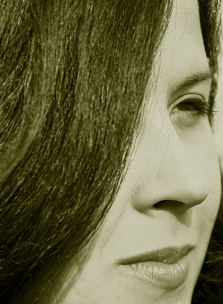
There are a few flaws that I see right from the start. First being the color its just got too much of a green tone to it, making a photo that is very nice a lot less appealling. Second problem I see with this is the nose gets lost. Part of the nose blends right in to the cheek and it appears there is a tip of the nose and a bridge but nothing inbetween.
Composition is your strong point here excellent composition. Would love to see this with different tones to it.
|
|
Comments Made During the Challenge  |
|
|
03/21/2004 05:34:51 AM |
| I love the composition with the sweeping curve of her hair but I don't find the green/gold toning to be all that flattering. Also, the light is a bit too strong on the nose and left cheek. You can see every wrinkle and pore on her face. |
|
|
|
03/18/2004 02:40:32 PM |
| very pretty model but I think the greenish cast to it really takes away from your shot...everything else is well done |
|
|
|
03/17/2004 03:54:35 PM |
| The color is TERRIBLE!! It's green! |
|
|
|
03/17/2004 09:08:30 AM |
| eye is dead, put a catchlight in it for a great inprovement! |
|
|
|
03/17/2004 04:20:04 AM |
| I like the tones and the sweep of her hair a lot, but I would suggest cleaning up the stray hairs across her nose and especially the one down by her lip. they distract from an otherwise very nice portrait. |
|
 Photographer found comment helpful. Photographer found comment helpful. |
|
|
03/16/2004 10:41:16 AM |
| I love the way the hair is actually part of the balance/negative space in this composition. I like the lighting and the details. The contrast is really nice. I'm not sure if it would improve things to be more of a black and white instead of a monocrhrome (it shows up slightly green on my monitor), but overall I really like it. Good luck! |
|
| Photographer found comment helpful. |
|
|
03/16/2004 04:05:04 AM |
| to me, the tint isn't flattering, a different colored tint might have worked better. |
|
| Photographer found comment helpful. |
|
|
03/16/2004 12:52:00 AM |
Unfortunately with close-up portraits you have to get the details perfect.
The stray hairs on the nose and lips, the small blemishes on the chin and cheek and the badly applied makeup really spoil this well-composed shot. |
|
| Photographer found comment helpful. |
|
|
03/15/2004 02:21:48 PM |
| Pretty girl and daring close crop. I love the tones. Nice entry. |
|
| Photographer found comment helpful. |
|
|
03/15/2004 08:56:47 AM |
| I like the composition on this one, there is a small patch under the eye where the edge definition has gone which is a shame. good effort |
|
| Photographer found comment helpful. |
|
|
03/15/2004 08:24:34 AM |
| Nice shot. Unfortunately the nose gets the immediate attention because of the hair line. Deeper contrast might have helped to bring out the details of her face. BOL |
|
| Photographer found comment helpful. |
|
|
03/15/2004 07:43:27 AM |
| A nice use of her hair to provide shape and framing. Such a close up demands more perfection though and I'd really like to remove those stray hairs on her face. It also feels as though she is squinting against bright light, and I'd like to see her eye opened to a more natural extent. Great choice to go black and white with a touch of toming (though it appears a touch too green for my tastes). |
|
| Photographer found comment helpful. |
|
|
03/15/2004 05:34:05 AM |
| I like the idea, but while her nose is sharp, her eye isn't and I can't say that I care for the greenish tone |
|
| Photographer found comment helpful. |
|
|
03/15/2004 03:01:07 AM |
| An interesting fragment - one wants to see more! One is drawn to the eye but I would have liked a pose that faced the camera by a just few degrees more. |
|
| Photographer found comment helpful. |
|
|
03/15/2004 01:44:14 AM |
| i like it, the really tight framing is refreshing. however, i think her cheek is too close to the right edge of the frame for comfort pull it away, let the dark background work to hilight her face! |
|
| Photographer found comment helpful. |
|
|
03/14/2004 07:24:19 PM |
| Good angle. I don't care too much for the tint. A few nits such as cloning out the hairs on the nose and lips and maybe trying to capture the eye a little more open although its pretty obvious from the lighting how bright it was. You lose a little definition on the bridge of the nose but short of punching up the contrast and then doing a selective curves on the shadow under the nose I'm not sure what you could do to preserve that piece of the shot. Overall its artistic and technically good. Good capture. |
|
| Photographer found comment helpful. |
Home -
Challenges -
Community -
League -
Photos -
Cameras -
Lenses -
Learn -
Help -
Terms of Use -
Privacy -
Top ^
DPChallenge, and website content and design, Copyright © 2001-2025 Challenging Technologies, LLC.
All digital photo copyrights belong to the photographers and may not be used without permission.
Current Server Time: 04/07/2025 12:59:21 PM EDT.