| Author | Thread |
Comments Made During the Challenge  |
|
|
01/29/2008 03:20:12 PM |
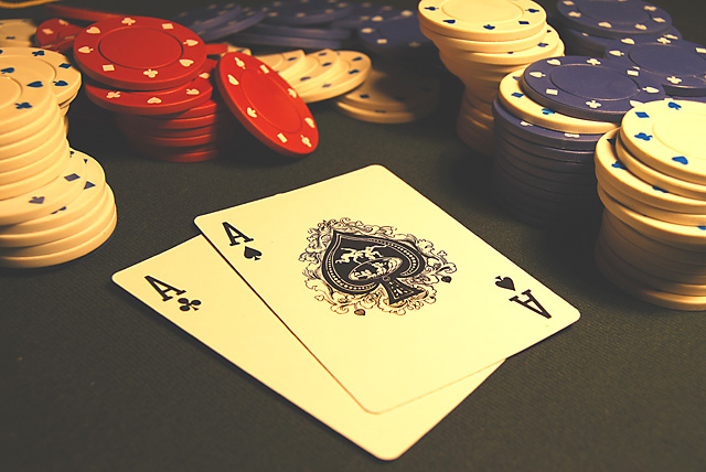
| May need a little more contrast to take out the foggy look. |
|
 Photographer found comment helpful. Photographer found comment helpful. |
|
|
01/28/2008 04:34:55 AM |
| There seems to be a slight yellow cast to this shot. |
|
| Photographer found comment helpful. |
|
|
01/27/2008 06:26:32 AM |
| The shot is well framed with the chips, but seems a bit hazy. I think even running this through the quick automatic adjustments in photoshop would help to take away the yellowish cast and brighten the whole shot a bit. |
|
| Photographer found comment helpful. |
|
|
01/27/2008 02:50:43 AM |
| This looks rather "washed-out" to me. I'd prefer it to have more contrast, with the blacks being blacker. |
|
| Photographer found comment helpful. |
|
|
01/26/2008 04:22:15 AM |
Hard luck I've trips of 2's!!!
Nice shot. Little bit yellow...slight whitle balance adjustment would improve this greatly.. |
|
| Photographer found comment helpful. |
|
|
01/24/2008 02:48:46 PM |
| Nice pic, maybe could do with a little more colour ... great title |
|
| Photographer found comment helpful. |
|
|
01/24/2008 08:57:40 AM |
| I like the photo, it feels like it's lightened too much a bit, because it feels like there's a fog over it, or the colors are muted or something...but, that could be my monitor too I suppose :D Good frame though! |
|
| Photographer found comment helpful. |
|
|
01/24/2008 06:27:35 AM |
| I did a similar idea to this in my submission, and although I think this is a little flat in contrast, I like it much more than my own picture, its a great subject idea for the challenge. Good luck :-) |
|
| Photographer found comment helpful. |
|
|
01/24/2008 05:51:18 AM |
| I really like this shot. It's well composed and does a great job of conveying the feeling of a poker match. On the technical side however, it seems like the white balance is a bit on the yellow side (at least on my monitor) which is a little distracting. All in all it's a really good shot though. |
|
| Photographer found comment helpful. |
|
|
01/24/2008 05:00:37 AM |
| Nice idea. A little too low contrast. |
|
| Photographer found comment helpful. |
|
|
01/24/2008 03:17:04 AM |
great image, lighting and focus are good, and the framing element is also there. i can't find anything wrong with it dammit :p
seriously, great shot :) |
|
| Photographer found comment helpful. |
|
|
01/23/2008 06:57:35 PM |
| Its a bit yellow for my taste. |
|
| Photographer found comment helpful. |
|
|
01/23/2008 12:52:06 PM |
|
| Photographer found comment helpful. |
|
|
01/23/2008 07:11:25 AM |
|
| Photographer found comment helpful. |
|
|
01/23/2008 06:14:12 AM |
| Good concept... the tipped red chip in the back makes it! |
|
| Photographer found comment helpful. |
|
|
01/23/2008 05:42:45 AM |
| The yellowish tone ruins it for me. |
|
| Photographer found comment helpful. |
|
|
01/22/2008 09:35:46 PM |
You seem to be doing well judging by the amount of chips you have :-)
You have a little bit of a yellowish cast on your picture. But great out-of-box-thinking in your ideas. Good luck :-) |
|
| Photographer found comment helpful. |
Home -
Challenges -
Community -
League -
Photos -
Cameras -
Lenses -
Learn -
Help -
Terms of Use -
Privacy -
Top ^
DPChallenge, and website content and design, Copyright © 2001-2025 Challenging Technologies, LLC.
All digital photo copyrights belong to the photographers and may not be used without permission.
Current Server Time: 04/07/2025 01:48:46 PM EDT.