| Author | Thread |
Comments Made During the Challenge  |
|
|
01/29/2008 11:02:50 PM |
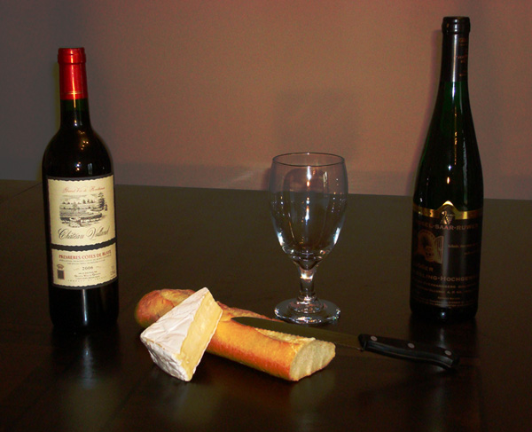
| The idea is very interesting - but looks like high ISO (artifacts on the wall) spoiled the image a bit. |
|
|
|
01/29/2008 09:05:02 AM |
This is a hard subject to pull off correctly. I know, I've tried once. :) The lighting and reflections are challenging to control on the glass and bottles. In this case the lighting it causing some harsh reflections. The POV taken is causing the back edge to distract as it cuts thru the objects. A lower angle, or different background would help this some. As for the framing part of this challenge, I'm not sure that this is really the idea. Personally I think the framing elements should be more in the foreground or background as suggested in the challenge description.
All JMO and observations. :) Good luck in the challenge. |
|
|
|
01/27/2008 06:12:06 PM |
|
|
|
01/27/2008 12:29:54 AM |
| I feel the lighting in this shot is a bit harsh. i also think that a solid single light colored background could help this as well. |
|
|
|
01/25/2008 12:33:17 PM |
| I'll come help you choose, must taste them both first :P |
|
|
|
01/24/2008 09:47:50 PM |
| my eyes kept scanning left to right and back, across the center of the photo, composition could be improved by trying to get my eyes move in a circle around the pic, or at minimum in a triangle. too much empty space on top and table horizon may be better place on the thirds, either i3 way from the bottom or from the to. Empty glass is a distraction. I would taken a vertical format pic and placed the bottles and other elements close together. I like the Brie! |
|
|
|
01/24/2008 11:07:22 AM |
| Needs better lighting, closer arrangement, more sharpness, more contrast between bottles and table, knife. |
|
|
|
01/23/2008 11:58:00 PM |
| I think the objects here are spread out a little too far and I see a lot of high ISO noise in the backdrop. Your file size is also a lot smaller than is allowed. Check your JPEG compression settings to come in as close as possible to the 150k limit and maintain image quality. |
|
|
|
01/23/2008 05:17:29 PM |
| I suppose the bottles are the frame? |
|
|
|
01/23/2008 04:50:29 PM |
| For this you may have wanted to add a backdrop or drape a sheet so that the colors don't look so incompatible. Maybe a black and white shot would have been better, but the horizon line between the table and the wall is kind of off putting. |
|
|
|
01/23/2008 07:08:32 AM |
| Seems like an ambiguous way of meeting the challenge - the bottles seem to be part of the still life, not a frame for it - and the bread even more so. Nice layout and lighting, though. |
|
Home -
Challenges -
Community -
League -
Photos -
Cameras -
Lenses -
Learn -
Help -
Terms of Use -
Privacy -
Top ^
DPChallenge, and website content and design, Copyright © 2001-2026 Challenging Technologies, LLC.
All digital photo copyrights belong to the photographers and may not be used without permission.
Current Server Time: 02/01/2026 11:09:23 AM EST.