| Author | Thread |
Comments Made During the Challenge  |
|
|
01/25/2008 11:32:22 PM |
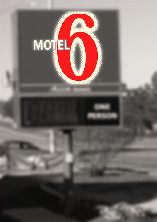
| Cute idea but *way* over-processed. Both the blur and the desaturation are too strong for my taste. |
|
 Photographer found comment helpful. Photographer found comment helpful. |
|
|
01/25/2008 01:48:12 PM |
| Nice concept... I don't like the fuzzy background with the clear 6. It is distracting. |
|
| Photographer found comment helpful. |
|
|
01/24/2008 10:30:24 AM |
|
| Photographer found comment helpful. |
|
|
01/24/2008 06:36:57 AM |
| I like how it jumps out but i think the blur is too strong. Also, the border detracts my eye from the top. It's alright though, but nothing special. |
|
| Photographer found comment helpful. |
|
|
01/23/2008 11:14:30 PM |
| The blur is quite distracting. Perhaps a simple desat would have been just as good. |
|
| Photographer found comment helpful. |
|
|
01/23/2008 09:15:37 PM |
| I like your concept, but not crazy about all the "noise" around the 6 itself. Good color treatment. |
|
| Photographer found comment helpful. |
|
|
01/22/2008 09:50:46 PM |
| To me, the selective desaturation doesn't really work here especially with the selective blurring (or sharpening). It does scream "six" though! :) |
|
| Photographer found comment helpful. |
|
|
01/21/2008 08:54:32 PM |
| Where do I register....nice use of blurring to make a point. |
|
| Photographer found comment helpful. |
|
|
01/21/2008 09:51:06 AM |
|
| Photographer found comment helpful. |
Home -
Challenges -
Community -
League -
Photos -
Cameras -
Lenses -
Learn -
Help -
Terms of Use -
Privacy -
Top ^
DPChallenge, and website content and design, Copyright © 2001-2026 Challenging Technologies, LLC.
All digital photo copyrights belong to the photographers and may not be used without permission.
Current Server Time: 02/01/2026 08:56:02 AM EST.