| Author | Thread |
Comments Made During the Challenge  |
|
|
03/14/2004 01:36:12 AM |
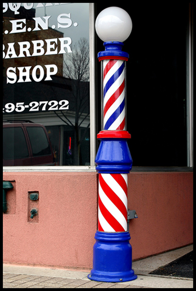
| This is an interesting subject but you have taken the picture at an uninteresting angle. If you took it from above or below it would haved given the viewer a perspective that one does not usually get. Also, it would have made the pole more central to the picture and removed alot of the distractions in the backround. |
|
 Photographer found comment helpful. Photographer found comment helpful. |
|
|
03/13/2004 09:39:51 AM |
| I like the color and composition here. It would have been even better without the reflection in the front window. Nice job. 6 |
|
| Photographer found comment helpful. |
|
|
03/12/2004 08:48:01 AM |
| blue looks just a bit oversaturated, and the crop needs more space at top and bottom |
|
| Photographer found comment helpful. |
|
|
03/11/2004 04:16:47 PM |
| really a nice shot...i would have scored higher but the reflection in the left side window is pretty distracting..the bright colors against the black window is very nice |
|
| Photographer found comment helpful. |
|
|
03/10/2004 12:12:20 PM |
| Great interpretation, reminds me of my neighborhood |
|
| Photographer found comment helpful. |
|
|
03/09/2004 02:58:24 PM |
| Simple and clean but very effective. Nice. BOL |
|
| Photographer found comment helpful. |
|
|
03/08/2004 06:17:18 PM |
| Too much dead space on the right. Should have shot more of the words on the window on the left, leaving the barber pole more on the right. Although then you'd have had the big reflection on the left! :) Tought one, you would have to try to Clone it out but that might be tough. |
|
| Photographer found comment helpful. |
|
|
03/08/2004 03:41:21 PM |
| Nice shot! the only part I would have done differently is waited for that SUV to move out of the reflection. Good luck. |
|
| Photographer found comment helpful. |
|
|
03/08/2004 01:13:02 PM |
| Interesting choice of subject, nicely framed. Would be interested in seeing how it would look with a long exposure so that the rotating stripes were motion-blured. |
|
| Photographer found comment helpful. |
|
|
03/08/2004 08:00:04 AM |
| vivid red, white, and blue. Nice and sharp but I think the pole is placed too much toward center. |
|
| Photographer found comment helpful. |
|
|
03/08/2004 07:59:08 AM |
| nice colors on the pole. perhaps a little too tight on the cropping. |
|
| Photographer found comment helpful. |
Home -
Challenges -
Community -
League -
Photos -
Cameras -
Lenses -
Learn -
Help -
Terms of Use -
Privacy -
Top ^
DPChallenge, and website content and design, Copyright © 2001-2025 Challenging Technologies, LLC.
All digital photo copyrights belong to the photographers and may not be used without permission.
Current Server Time: 04/08/2025 04:44:11 AM EDT.