| Author | Thread |
|
|
02/08/2008 05:05:33 AM |
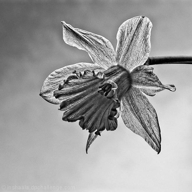
As one commenter stated this is more like a pencil drawing than photograph. Almost looks over sharpened due to the HDR. I would suggest a concept like this.

Then gradually merge from real daff with color to the pencil drawn one. Just a thought. |
|
|
|
02/08/2008 05:05:13 AM |
| Well, this proves that the DPC crowd has a wide range of likes and dislikes, because I love this shot the way it is. I think the crop is lovely, and the b&w conversion is perfect. I had given it an 8. I like how it appears to be glowing. ;) |
|
|
|
02/08/2008 04:31:35 AM |
| Gave it a 6. Liked the conversion. Prefer a slightly tighter crop though. |
|
|
|
02/08/2008 04:25:06 AM |
| Rich, I like the shot and agree with Becky about the rotation..I think it needed a little angular movement in the composition to set it apart (perhaps the dark stem coming in at an angle). I gave it a 6 during voting and would probably given it 1 mark higher without the HDR look. It feels like it has gone out of the realm of photography and into the realm of pencil drawing which might have been why it scored lower than expected. I would like to see the background burned some which might help the flower stand out more too. Anyway, overall I liked the shot and don't get too down on that 5.33 in a free study..that is not a bad score at all for a DPC free study. |
|
|
|
02/08/2008 04:22:56 AM |
| I'm tired of HDR, but you have a good eye for beauty. I gave this a 6. |
|
|
|
02/08/2008 04:14:47 AM |
| I like the B/W. I think it would have looked neat if you rotated where the the flower was dropping down into the frame or rotated where it was popping up into the frame instead of from the side. Try burning around the edges of the frame ever so slightly to see if it makes the flower pop even more. I think the grain adds some interest. It is a very nice photo and didn't deserve a low 5 but that is my opinion. I also love the simplicity of the shot. Hopefully you will get some good constructive comments from others who have way more experience than myself. |
|
Comments Made During the Challenge  |
|
|
02/01/2008 08:30:50 AM |
| I love that you put this in black and white. |
|
 Photographer found comment helpful. Photographer found comment helpful. |
Home -
Challenges -
Community -
League -
Photos -
Cameras -
Lenses -
Learn -
Help -
Terms of Use -
Privacy -
Top ^
DPChallenge, and website content and design, Copyright © 2001-2025 Challenging Technologies, LLC.
All digital photo copyrights belong to the photographers and may not be used without permission.
Current Server Time: 04/08/2025 12:58:52 PM EDT.