| Author | Thread |
|
|
02/01/2008 04:19:00 PM |
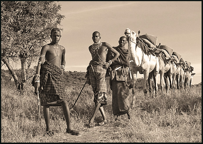
Several people have mentioned that they would like to see the color version of this picture. So I thought I should upload it. I went with the Sepia because I felt like it hid some of the flaws that I couldn't figure out how to get rid of (especially shadows on the warriors faces). I would be interested to hear opinions on whether the color version would have been a better choice. I seem to be making poor choices on which picture to enter and on editing and am always looking to learn.
|
|
|
|
02/01/2008 03:57:48 PM |
Greetings from the Critique Club.
Wow, that's a fantastic image actually. And I appear to have given it a 4 during voting. Sorry, on second look, that was actually very unfair of me.
To explain why - it was something about the post-processing. I think I briefly thought: "Oh, interesting image, but it's all a bit too monotone/sepia for me". And I barely even noticed that wonderful line of camels! (god, I feel bad now!)
So, yeah. Overall, I think the image is fantastic. Interesting subject matter, you've got spot on focus with pretty much a vanishing point of camels emerging from it, it's wonderful really.
Post-processingwise, however, I think maybe the picture could do with a bit more contrast, and maybe some dodging and burning, or soft light layers, to bring out bits of it. I'd also consider chopping off a bit of the tree on the left, to make the viewer focus more immediately on the first boy in the line. And the sepia... Maybe it's a personal preference, I'm just not too keen on it. I'd be interested to see it in colour - Africa has such lovely tones... Or even plain B&W I think works. It's just, sepia sort of makes me think old 1920s shots, whereas this shot could be a lot more alive than that.
And on a finishing note - I love that first camel's smile!!!
Anyway, great pic, congratulations on your new top score, and I hope to see more amazing work from you in the future!
Jelena |
|
 Photographer found comment helpful. Photographer found comment helpful. |
|
|
01/28/2008 09:45:30 AM |
I love this shot, thought it would do much better. Congrats on the score even so,
Jack |
|
| Photographer found comment helpful. |
Comments Made During the Challenge  |
|
|
01/27/2008 11:43:20 AM |
| why the two tone? i would have loved to see the colors in this image. |
|
| Photographer found comment helpful. |
|
|
01/27/2008 09:52:27 AM |
this reminds me of 'The gods must be crazy'
awesome image and the classic editing suits it well
8 |
|
| Photographer found comment helpful. |
|
|
01/27/2008 08:26:09 AM |
| Remarkable angularity. The wall of camels is incredible. All the subjects are in fact lined up perfectly, pleasing to the eyes but so perfect as to be unsettling. I mean that in a good way. |
|
| Photographer found comment helpful. |
|
|
01/26/2008 02:55:37 PM |
| What a perfect set up!!! Would have loved to see this one in color - nice one. |
|
| Photographer found comment helpful. |
|
|
01/26/2008 08:40:18 AM |
| This is too sweet! Love the line of camels. The old processing is perfect for this image. |
|
| Photographer found comment helpful. |
|
|
01/26/2008 03:54:56 AM |
| Great composition and lines with the camels. The conversion to B&W is a little flat and the shadows are a little dull (image is a little overexposed)which may hurt your score. Needs some more contrast as well. Nonetheless, I great experience and image for anyone's collection. Good Luck. 5. |
|
| Photographer found comment helpful. |
|
|
01/25/2008 08:37:36 PM |
| nice one... has that old time look to the photo. |
|
| Photographer found comment helpful. |
|
|
01/23/2008 05:58:14 AM |
| Very nice on so many levels. I fully expect to see this near the top of the pile. |
|
| Photographer found comment helpful. |
|
|
01/21/2008 02:12:14 PM |
| North West Africa? Like a historic photograph. 8. |
|
| Photographer found comment helpful. |
|
|
01/21/2008 08:29:31 AM |
| I would be interested in seeing the color version of this. It looks like there might be the potential to show off some really nice colors. |
|
| Photographer found comment helpful. |
|
|
01/21/2008 03:36:21 AM |
| Amazing subject, very well captured, however the tone doesn't work for me... I think it's the association with Africa, that makes me feel it should be a little warmer :) |
|
| Photographer found comment helpful. |
Home -
Challenges -
Community -
League -
Photos -
Cameras -
Lenses -
Learn -
Help -
Terms of Use -
Privacy -
Top ^
DPChallenge, and website content and design, Copyright © 2001-2025 Challenging Technologies, LLC.
All digital photo copyrights belong to the photographers and may not be used without permission.
Current Server Time: 04/09/2025 08:55:18 PM EDT.