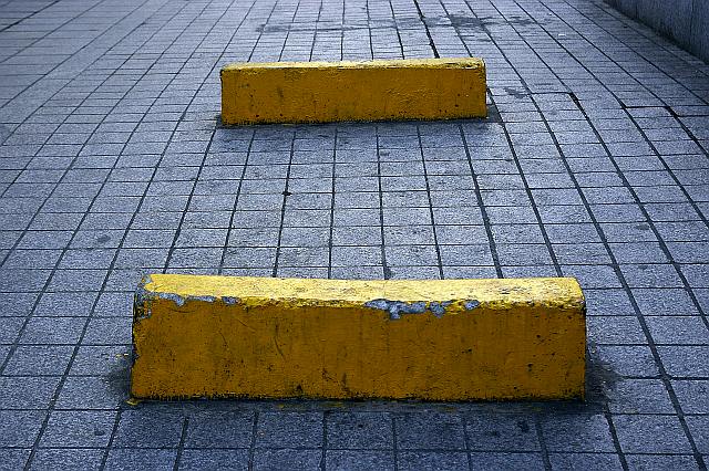
Thanks for the comments, votes and looking at this photo.
I tried getting rid of the wall on the right, but then these two yellow things became too big, overwhelming the image. I didn't want that. Vertical composition didn't look good either, although, now I'm thinking maybe I should not have had such a high point of view, but lower my body a bit. I should try again.
I wanted the title of the photo to be =, only =, just a graphic title like the image. But, the system needs an alphanumeric sign, so I had to add something that didn't take away from the geometry, so ended up with this stupid latin title. |