| Author | Thread |
|
|
01/22/2008 11:55:04 PM |
| hey Tim, this is really nice.. where was it taken? |
|
 Photographer found comment helpful. Photographer found comment helpful. |
Comments Made During the Challenge  |
|
|
01/20/2008 05:29:36 PM |
| good composition, but turn the greens down!! :) |
|
| Photographer found comment helpful. |
|
|
01/20/2008 12:12:00 PM |
| maybe oversaturated but still prety |
|
| Photographer found comment helpful. |
|
|
01/20/2008 10:01:19 AM |
| Very nice composition but it looks oversaturated to me. |
|
| Photographer found comment helpful. |
|
|
01/19/2008 06:08:24 AM |
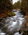
| Too HDR for me...I'm not used to blue rocks. The green looks absolutely toxic, lol, but a beautiful color. It's a great shot, just not my cup o' tea. 6 |
|
| Photographer found comment helpful. |
|
|
01/18/2008 09:58:17 AM |
| Beautiful colors, but the long exposure makes it all look fake. |
|
| Photographer found comment helpful. |
|
|
01/18/2008 09:52:34 AM |
| the green of the fern leaves on the sides seem a little too bright to me. i do love the way you did the colour of the water and the swirls in the foreground. very nice overall. |
|
| Photographer found comment helpful. |
|
|
01/15/2008 08:45:05 PM |
| I love the flow and the trails in the foreground water. However, the oversaturation of the green makes it look over-processed. |
|
| Photographer found comment helpful. |
|
|
01/15/2008 06:30:33 PM |
| Congrats! A sure top contender here and my favorite of the challenege. |
|
| Photographer found comment helpful. |
|
|
01/15/2008 09:08:02 AM |
| Very good, but too much saturation for me |
|
| Photographer found comment helpful. |
|
|
01/14/2008 11:53:41 PM |
| Nice shot, seems a little over saturated. |
|
| Photographer found comment helpful. |
|
|
01/14/2008 08:27:30 PM |
greens look over sat
great composition of flow through the photo |
|
| Photographer found comment helpful. |
|
|
01/14/2008 08:14:27 PM |
| On my monitor, the colors seem very un-natural. |
|
| Photographer found comment helpful. |
|
|
01/14/2008 07:29:36 PM |
| The processing really makes this photo pop out at you... nice DOF and exposure. |
|
| Photographer found comment helpful. |
|
|
01/14/2008 01:08:01 PM |
| A little oversaturated and a bit wonky on the color balance. I like the overall composition though. :) |
|
| Photographer found comment helpful. |
|
|
01/14/2008 11:58:44 AM |
| Too much saturation. The red colors look unatural, otherwise good composition. |
|
| Photographer found comment helpful. |
|
|
01/14/2008 03:42:12 AM |
| Too much saturation. The bright green pulls your eyes to the outside of the frame. Otherwise great shot. |
|
| Photographer found comment helpful. |
|
|
01/14/2008 03:40:25 AM |
|
| Photographer found comment helpful. |
|
|
01/14/2008 12:16:39 AM |
| The colours are too saturated. |
|
| Photographer found comment helpful. |
Home -
Challenges -
Community -
League -
Photos -
Cameras -
Lenses -
Learn -
Help -
Terms of Use -
Privacy -
Top ^
DPChallenge, and website content and design, Copyright © 2001-2025 Challenging Technologies, LLC.
All digital photo copyrights belong to the photographers and may not be used without permission.
Current Server Time: 04/07/2025 02:23:01 AM EDT.