| Author | Thread |
|
|
01/10/2008 05:06:50 PM |
Greetings from the Critique Club -
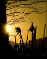
My first reaction to this image is "Cool colors". Nice job of catching complimentary colors between the sky and building. The general comp is somewhat pleasing though I think I would prefer to see an even wilder angle on the building.
What I think this image suffers from most is oversharpening. Where the building should be sharp its a bit much. And way overdone on the sky. I think if you had left the sky alone when it came time to sharpen and maybe even gone heavy on Neat Image or something you woudl have had an even better contrast - smooth and sharp. As it is though its just too grainy.
I think 5.3 may be a little low overall as it meets the challenge, but I wouldnt have expected it to score a whole lot higher than say a 5.6.
Hope some of this may help.
Tim |
|
 Photographer found comment helpful. Photographer found comment helpful. |
Comments Made During the Challenge  |
|
|
01/05/2008 12:31:13 AM |
| kind of a standard concept, but your execution is enthusiastic and interesting. |
|
| Photographer found comment helpful. |
|
|
01/01/2008 05:32:26 PM |
| I see some effort at an interesting perspective on tis. Unfortunately, there seems to be a lot of artifacting around the edge of the building and the straight lines have a lot of stair-stepping showing. Try different resampling settings when you downsize images like this. The clouds also came through as grainy and patchy rather than the really cool look that I am sure they had in real life. |
|
| Photographer found comment helpful. |
Home -
Challenges -
Community -
League -
Photos -
Cameras -
Lenses -
Learn -
Help -
Terms of Use -
Privacy -
Top ^
DPChallenge, and website content and design, Copyright © 2001-2026 Challenging Technologies, LLC.
All digital photo copyrights belong to the photographers and may not be used without permission.
Current Server Time: 02/01/2026 09:43:45 AM EST.


![The Penthouse [Fisheye View]](https://images.dpchallenge.com/images_challenge/0-999/792/1200/Copyrighted_Image_Reuse_Prohibited_626992.jpg)


