| Author | Thread |
|
|
12/30/2007 03:27:13 AM |
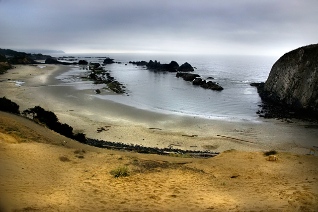
I actually love this image. Not too heavy-handed for me at all. The colors are beautiful, and it has a very serene feeling.
I agree with the commenter who mentioned the curve on the horizon though - that also bugs me a little. |
|
 Photographer found comment helpful. Photographer found comment helpful. |
|
|
12/30/2007 03:17:33 AM |
It looks very over-processed. The D&B is quite blotchy and uneven which immediately draws the eye. I'd say pull it all back. Keep it simple.
Message edited by author 2007-12-30 09:48:01. |
|
| Photographer found comment helpful. |
|
|
12/30/2007 02:00:26 AM |
| Michelle- I quite like the processing and heavy handed feel of the processing. It seems so remote and forlorn here. I am not sure about the crop on the left - I would like to see the sweep of the rocks all around (dark line seems to be cut off a bit as it comes from the top, down the left and then to the right). The tones really work for me, especially on the sand. The waves on the beach are an outstanding feature of the shot and i almost wish it where emphasized more (a closer crop on that as a second shot). |
|
| Photographer found comment helpful. |
|
|
12/29/2007 09:55:00 PM |
| i have not read the other comments but i love how the sky blends right into the sea |
|
| Photographer found comment helpful. |
|
|
12/28/2007 11:44:55 AM |
In response to your request. I'm curious to see the original. If you would share some of your pp would be good too. Also, some insight into your 'vision' for this image; scene, 'feel', colors, etc.
As is, the combination of the curvature of the horizon, the shoreline and the angle/perspective you have taken this image from, makes the image seem off balance, or 'skewed', in a sense. The colors seem a little washed out and, as mentioned below (I don't usually read others' comments before making my own, but did this time), the pp seems to have diminished those colors and, in my opinion, also the textures and detail - which I do wish to see.
Another reason to see the original was to see if perhaps more could be included for added compositional balance.
I like the shape and patterns of the water (seemingly) gently coming in at the foreshore on the right and the other few elements that seem there, but not 'enhanced' (such as the wood/sticks). I wonder what those little things at the edge and in the water are.. Aside from the (tiny) sign visible on the right and the (seeming) footsteps in the sand, looks like quite an untouched scene. |
|
| Photographer found comment helpful. |
|
|
12/28/2007 10:04:55 AM |
oooh I agree with Tez...this would be a great photo for a strong black and white! I also agree on the dodge/burn..more so on the burning of the white sand down by the water. Its just too much there I think. the yellow sand dodge/burn i think leads my eyes down into the photo along with the sky. my eyes just get stuck on the dark grey area where it meets the water. I think If you fix that it would be perfect (to me at least) hope this helped.
~~Cher~~ |
|
| Photographer found comment helpful. |
|
|
12/28/2007 07:56:20 AM |
| There is a slight curve to the horizon, which I'd straighten. To me it disrupts the flow of the shot. That cut off rock on the right overpowers the smaller ones to some extent. It's a nice image, though I think a tighter crop might do well for it also. I'd be interested in seeing some other results with the same image. |
|
| Photographer found comment helpful. |
|
|
12/28/2007 01:11:26 AM |
First off, I like the colours. I like how there's a gradient from the ochre shade to the steel-blue of the sky at the top, that isn't much to do with you but mroe fo the scene you captured.
As for composition: I think you did a good job as it represents the scene well, and since i've never been there, looks like a decent enough viewpoint. I can't help thinking maybe if you were lower down it would look cooler, or if you were nearer to those rocks in the water, or EVEN if you stood in the water in between those 2 channels of rocks and saw what was down there... nevertheless, I like it.
Thing that bothers me is the dodge/burn going on, it's too obvious and makes it look mottled in parts and underexposed in others. Burning has a tendency to dull things and dodging has a tendency to shift colours. I think if you did it on a seperate layer, changed the mode to 'luminosity' (doesn't alter colour info) and maybe reduced the opacity... or even if you made a new layer, painted solid black/white on the bits you wanted to darken/lighten and then set a guassian blur at high strength to blend it in, it would look better and more natural.
But having said all that, I like it, I like the almost square crop and the leading lines to the distant shore. Maybe a bit mroe contrast, or better yet, put it in B&W! |
|
| Photographer found comment helpful. |
Home -
Challenges -
Community -
League -
Photos -
Cameras -
Lenses -
Learn -
Help -
Terms of Use -
Privacy -
Top ^
DPChallenge, and website content and design, Copyright © 2001-2025 Challenging Technologies, LLC.
All digital photo copyrights belong to the photographers and may not be used without permission.
Current Server Time: 04/08/2025 09:50:31 AM EDT.