| Author | Thread |
|
|
01/10/2008 12:03:37 PM |
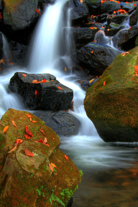
| I like the composition and the detail of this image. However, I think the color in general, and the leaves in particular, are a over saturated to a point where the leaves become a distraction. I also think there is too much contrast - the water fall is too over exposed and part of it has lost all color. But again, great photo, just a little too much in the post-processing. |
|
|
|
12/26/2007 05:18:00 PM |
| Oh my gosh that color is just amazing. |
|
|
|
12/18/2007 03:56:09 AM |
| That is just gorgeous. The saturation of red, orange and green really pops off of the page. |
|
|
|
12/18/2007 01:49:08 AM |
| I like the colors of autumn and the water flowing. the white at the top of the waterfall is a bit harsh though. |
|
Home -
Challenges -
Community -
League -
Photos -
Cameras -
Lenses -
Learn -
Help -
Terms of Use -
Privacy -
Top ^
DPChallenge, and website content and design, Copyright © 2001-2025 Challenging Technologies, LLC.
All digital photo copyrights belong to the photographers and may not be used without permission.
Current Server Time: 04/07/2025 11:14:37 AM EDT.